The mpg dataset is contained in ggplot2 (part of tidyverse which we installed earlier), so mpg = ggplot2::mpg will create the mpg dataset. Do this first.
Using conditionals we learned on Tuesday (case_when or maybe between or any other way you choose) and using the %>% pipe, do the following:
Keep only the year 2008
Create a column called engine and set it equal to “small” if it has fewer than 8 cylinders (cyl) and “large” if it’s 8 or more
Summarize the data so that it reports the average highway fuel economy (hwy) and the average city fuel economy (cty) for each engine group
Looking at the numbers and character strings that define a dataset is rarely useful. To convince yourself, print and stare at the US murders data table:
library(dslabs)data(murders)head(murders)
       state abb region population total
1    Alabama  AL  South    4779736   135
2     Alaska  AK   West     710231    19
3    Arizona  AZ   West    6392017   232
4   Arkansas  AR  South    2915918    93
5 California  CA   West   37253956  1257
6   Colorado  CO   West    5029196    65
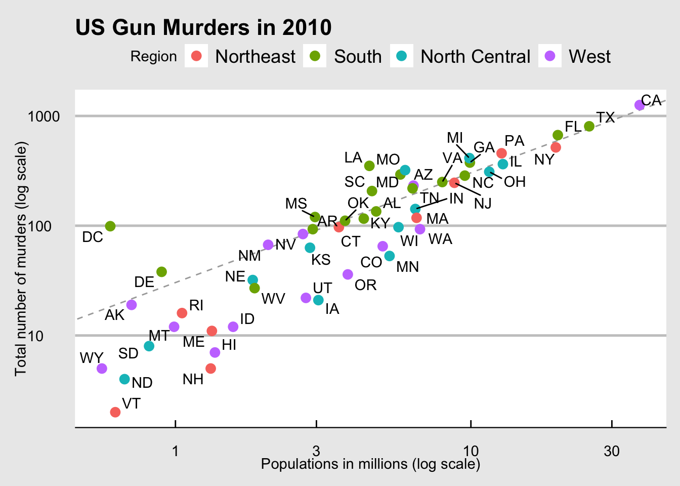
What do you learn from staring at this table? Even though it is a relatively straightforward table, we can’t learn anything. For starters, it is grossly abbreviated, though you could scroll through. In doing so, how quickly might you be able to determine which states have the largest populations? Which states have the smallest? How populous is a typical state? Is there a relationship between population size and total murders? How do murder rates vary across regions of the country? For most folks, it is quite difficult to extract this information just by looking at the numbers. In contrast, the answers to the questions above are readily available from examining this plot:
We are reminded of the saying: “A picture is worth a thousand words”. Data visualization provides a powerful way to communicate a data-driven finding. In some cases, the visualization is so convincing that no follow-up analysis is required. You should consider visualization the most potent tool in your data analytics arsenal.
The growing availability of informative datasets and software tools has led to increased reliance on data visualizations across many industries, academia, and government. A salient example is news organizations, which are increasingly embracing data journalism and including effective infographics as part of their reporting.
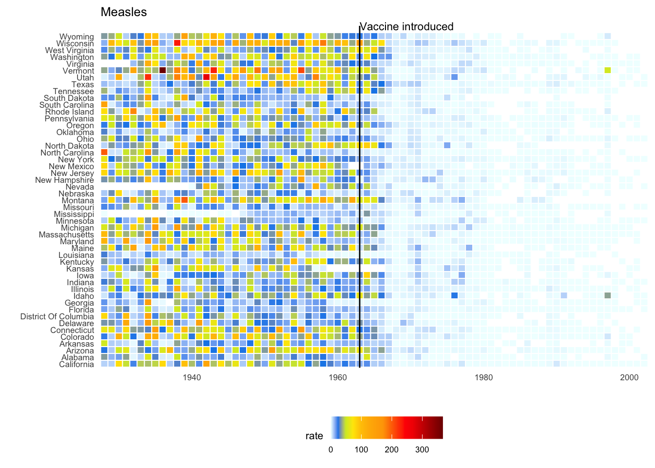
A particularly salient example—given the current state of the world—is a Wall Street Journal article1 showing data related to the impact of vaccines on battling infectious diseases. One of the graphs shows measles cases by US state through the years with a vertical line demonstrating when the vaccine was introduced.
That chart runs on data somebody set out to collect: a century of state health departments counting cases and filing reports. The Journal is just as good at the opposite. In 2022 it worked out when Elon Musk tweets — not what he tweeted, when. It turns out he was posting heavily somewhere around 3am, which is a fact about a man running several companies that no press release was ever going to tell you.
They did it with nothing but timestamps. Every post carries one, nobody thinks of it as data, and it quietly records when you were awake.
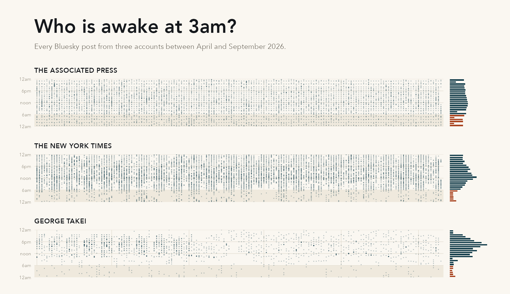
We can’t redo their exact analysis — X now charges for the data. But it works anywhere people post in public, so here is 2026, on Bluesky: two newsrooms and one person. Every dot is a single post, placed at the hour it went out in its author’s own local time. The bars along the right edge are those same posts counted by hour of the day, with the small hours in red.
The Associated Press barely has a night. Nineteen percent of its posts go out between midnight and 6am, and even the weekend does not slow things down much: 38 posts on an average weekday, 29 on a Saturday. That is pretty much what you would expect from a wire service with staff in every time zone.
The New York Times actually posts more than the AP during this period, but almost none of it lands overnight. Just 8 percent of its posts appear between midnight and 6am, compared with 19 percent for the AP. Weekends make a much bigger difference too: 63 posts on a weekday, 37 on a Saturday. And those vertical streaks in the figure? Those are days when something happened.
George Takei is different again. He has 1.3 million followers, but his account keeps remarkably normal hours: almost nothing before 10am or after 9pm Pacific, and Saturdays are much quieter—about 15 posts on a weekday versus 7 on a weekend day. Whatever is happening behind that account, this is not someone simply posting whenever a thought occurs to him. It looks like work, and there is a decent chance it is not all his work.
We learned all of that without asking anyone a single question. It came from seventeen thousand timestamps and about a hundred lines of code, which you can read here. You are not expected to be able to write that code yet. And, to be fair, I spent an embarrassing amount of time choosing the color of the paper. Take that part away and the actual analysis is read_csv, a timezone conversion, count, and two geoms. Those geoms are what we are going to talk about for the rest of today.
Another striking example comes from a New York Times chart2, which summarizes scores from the NYC Regents Exams. As described in the article3, these scores are collected for several reasons, including to determine if a student graduates from high school. In New York City you need a 65 to pass. The distribution of the test scores forces us to notice something somewhat problematic:
The most common test score is the minimum passing grade, with very few scores just below the threshold. This unexpected result is consistent with students close to passing having their scores bumped up.
This is an example of how data visualization can lead to discoveries which would otherwise be missed if we simply subjected the data to a battery of data analysis tools or procedures. Data visualization is the strongest tool of what we call exploratory data analysis (EDA). John W. Tukey4, considered the father of EDA, once said,
“The greatest value of a picture is when it forces us to notice what we never expected to see.”
Many widely used data analysis tools were initiated by discoveries made via EDA. EDA is perhaps the most important part of data analysis, yet it is one that is often overlooked.
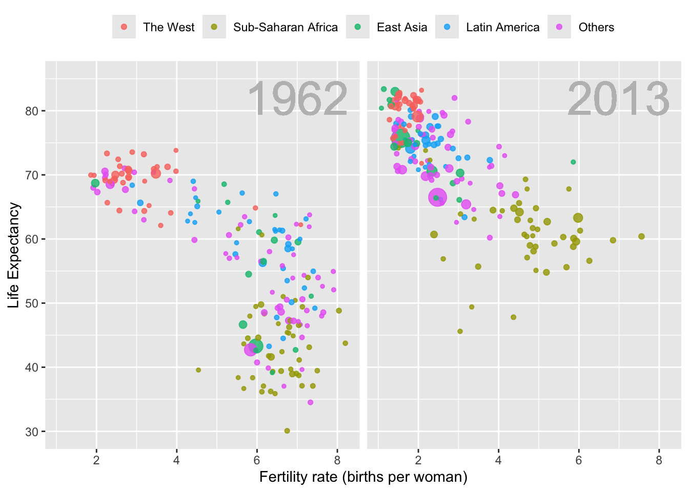
Data visualization is also now pervasive in philanthropic and educational organizations. In the talks New Insights on Poverty5 and The Best Stats You’ve Ever Seen6, Hans Rosling forces us to notice the unexpected with a series of plots related to world health and economics. In his videos, he uses animated graphs to show us how the world is changing and how old narratives are no longer true.
An example of the sort of exploratory data analysis and visualization Rosling created is:
It is also important to note that mistakes, biases, systematic errors and other unexpected problems often lead to data that should be handled with care. Failure to discover these problems can give rise to flawed analyses and false discoveries. As an example, consider that measurement devices sometimes fail and that most data analysis procedures are not designed to detect these. Yet these data analysis procedures will still give you an answer. The fact that it can be difficult or impossible to notice an error just from the reported results makes data visualization particularly important.
Of course, there is much more to data visualization than what we cover here. The following are references for those who wish to learn more:
ER Tufte (1983) The visual display of quantitative information. Graphics Press.
ER Tufte (1990) Envisioning information. Graphics Press.
ER Tufte (1997) Visual explanations. Graphics Press.
WS Cleveland (1994) The elements of graphing data. CRC Press.
A Gelman, C Pasarica, R Dodhia (2002) Let’s practice what we preach: Turning tables into graphs. The American Statistician 56:121-130.
NB Robbins (2004) Creating more effective graphs. Wiley.
A Cairo (2013) The functional art: An introduction to information graphics and visualization. New Riders.
N Yau (2013) Data points: Visualization that means something. Wiley.
There are a number of resources for data visualization design, including MSU Library offerings, plus catalogs of graph types in our resources.
We also do not cover interactive graphics, a topic that is both too advanced for this course and too unwieldy. Some useful resources for those interested in learning more can be found below, and you are encouraged to draw inspiration from those websites in your projects:
PLS202, a prerequisite for EC242, includes extensive coding in R, including the use of ggplot2 (which I’ll just call ggplot from now on). Therefore, we don’t review the basics here. Ask questions if you’re unsure. Posit (the maker of RStudio) has a nice tutorial here and a cheat sheet / tutorial available here
We’ll cover the necessary elements of this here.
The components of a graph
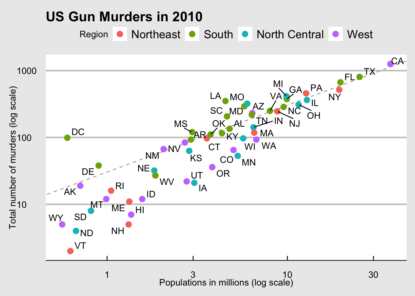
We will eventually construct a graph that summarizes the US murders dataset that looks like this:
We can clearly see how much states vary across population size and the total number of murders. Not surprisingly, we also see a clear relationship between murder totals and population size. A state falling on the dashed grey line has the same murder rate as the US average. The four geographic regions are denoted with color, which depicts how most southern states have murder rates above the average.
This data visualization shows us pretty much all the information in the data table. The code needed to make this plot is relatively simple. We will learn to create the plot part by part.
Let’s break down the plot above and introduce some of the ggplot2 terminology. The main five components to note are:
Data: The US murders data table is being summarized. We refer to this as the data component.
Geometry: The plot above is a scatterplot. This is referred to as the geometry component. Other possible geometries are barplot, histogram, smooth densities, qqplot, boxplot, pie (ew!), and many, many more. We will learn about these later.
Aesthetic mapping: The plot uses several visual cues to represent the information provided by the dataset. The two most important cues in this plot are the point positions on the x-axis and y-axis, which represent population size and the total number of murders, respectively. Each point represents a different observation, and we map data about these observations to visual cues like x- and y-scale. Color is another visual cue that we map to region. We refer to this as the aesthetic mapping component. How we define the mapping depends on what geometry we are using.
Annotations: These are things like axis labels, axis ticks (the lines along the axis at regular intervals or specific points of interest), axis scales (e.g. log-scale), titles, legends, etc.
Style: An overall appearance of the graph determined by fonts, color palettes, layout, blank spaces, and more.
We also note that:
The points are labeled with the state abbreviations.
The range of the x-axis and y-axis appears to be defined by the range of the data. They are both on log-scales.
There are labels, a title, a legend, and we use the style of The Economist magazine.
All of the flexibility and visualization power of ggplot is contained in these four elements (plus your data)
ggplot objects
We will now construct the plot piece by piece.
We start by loading the dataset:
library(dslabs)data(murders)
The first step in creating a ggplot2 graph is to define a ggplot object. We do this with the function ggplot, which initializes the graph. If we read the help file for this function, we see that the first argument is used to specify what data is associated with this object:
ggplot(data = murders)
We can also pipe the data in as the first argument. So this line of code is equivalent to the one above:
murders %>%ggplot()
It renders a plot, in this case a blank slate since no geometry has been defined. The only style choice we see is a grey background.
What has happened above is that the object was created and, because it was not assigned, it was automatically evaluated. But we can assign our plot to an object, for example like this:
To render the plot associated with this object, we simply print the object p. The following two lines of code each produce the same plot we see above:
print(p)p
Geometries (briefly)
In ggplot2 we create graphs by adding geometry layers. Layers can define geometries, compute summary statistics, define what scales to use, create annotations, or even change styles. To add layers, we use the symbol +. In general, a line of code will look like this:
DATA %>% ggplot() + LAYER 1 + LAYER 2 + ... + LAYER N
Usually, the first added layer after ggplot() + defines the geometry. After that, we may add additional geometries, we may rescale an axis, we may add annotations and labels, or we may change the style. For now, we want to make a scatterplot like the one you all created in your first lab. What geometry do we use?
Taking a quick look at the cheat sheet, we see that the ggplot2 function used to create plots with this geometry is geom_point.
Geometry function names follow the pattern: geom_X where X is the name of some specific geometry. Some examples include geom_point, geom_bar, and geom_histogram. You’ve already seen a few of these. We will start with a scatterplot created using geom_point() for now, then circle back to more geometries after we cover aesthetic mappings, layers, and annotations.
For geom_point to run properly we need to provide data and an aesthetic mapping. The simplest mapping for a scatter plot is to say we want one variable on the X-axis, and a different one on the Y-axis, so each point is an {X,Y} pair. That is an aesthetic mapping because X and Y are aesthetics in a geom_point scatterplot.
We have already connected the object p with the murders data table, and if we add the layer geom_point it defaults to using this data. To find out what mappings are expected, we read the Aesthetics section of the ?geom_point help file:
> Aesthetics
>
> geom_point understands the following aesthetics (required aesthetics are in bold):
>
> **x**
>
> **y**
>
> alpha
>
> colour
>
> fill
>
> group
>
> shape
>
> size
>
> stroke
and—although it does not show in bold above—we see that at least two arguments are required: x and y. You can’t have a geom_point scatterplot unless you state what you want on the X and Y axes.
Aesthetic mappings
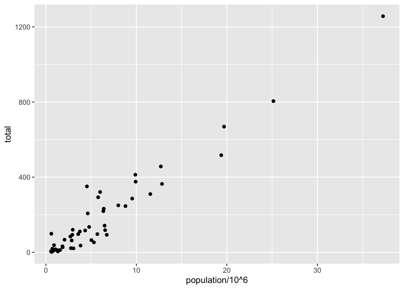
Aesthetic mappings describe how properties of the data connect with features of the graph, such as distance along an axis, size, or color. The aes function connects data with what we see on the graph by defining aesthetic mappings and will be one of the functions you use most often when plotting. The outcome of the aes function is often used as the argument of a geometry function. This example produces a scatterplot of population in millions (x-axis) versus total murders (y-axis):
murders %>%ggplot() +geom_point(aes(x = population/10^6, y = total))
Instead of defining our plot from scratch, we can also add a layer to the p object that was defined above as p <- ggplot(data = murders):
p +geom_point(aes(x = population/10^6, y = total))
The scales and annotations like axis labels are defined by default when adding this layer (note the x-axis label is exactly what we wrote in the function call). Like dplyr functions, aes also uses the variable names from the object component: we can use population and total without having to call them as murders$population and murders$total. The behavior of recognizing the variables from the data component is quite specific to aes. With most functions, if you try to access the values of population or total outside of aes you receive an error.
Note that we did some rescaling within the aes() call - we can do simple things like multiplication or division on the variable names in the ggplot call. The axis labels reflect this. We will change the axis labels later.
The aesthetic mappings are very powerful - changing the variable in x= or y= changes the meaning of the plot entirely. We’ll come back to additional aesthetic mappings once we talk about aesthetics in general.
Aesthetics in general
Even without mappings, a plot’s aesthetics can be useful. Things like color, fill, alpha, and size are aesthetics that can be changed.
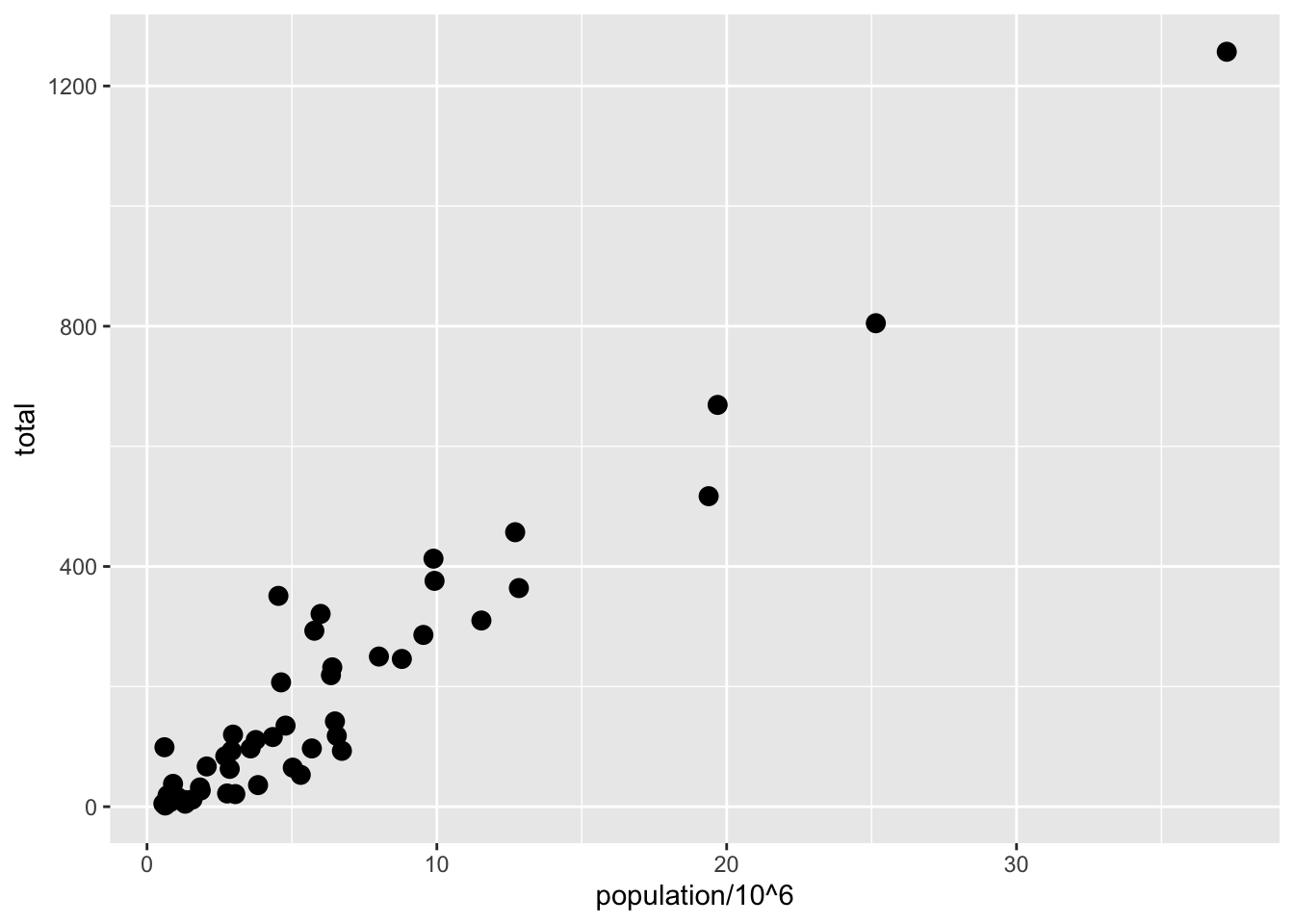
Let’s say we want larger points in our scatterplot. The size aesthetic can be used to set the size. The scale of size is in millimeters, and the default for points is size = 1.5—so the size = 3 below is twice as big as the default
p +geom_point(aes(x = population/10^6, y = total), size =3)
size is an aesthetic, but here it is not a mapping so it is not in the aes() part: whereas mappings use data from specific observations and need to be inside aes(), operations we want to affect all the points the same way do not need to be included inside aes. We’ll see what happens if size is inside aes(size = xxx) in a second.
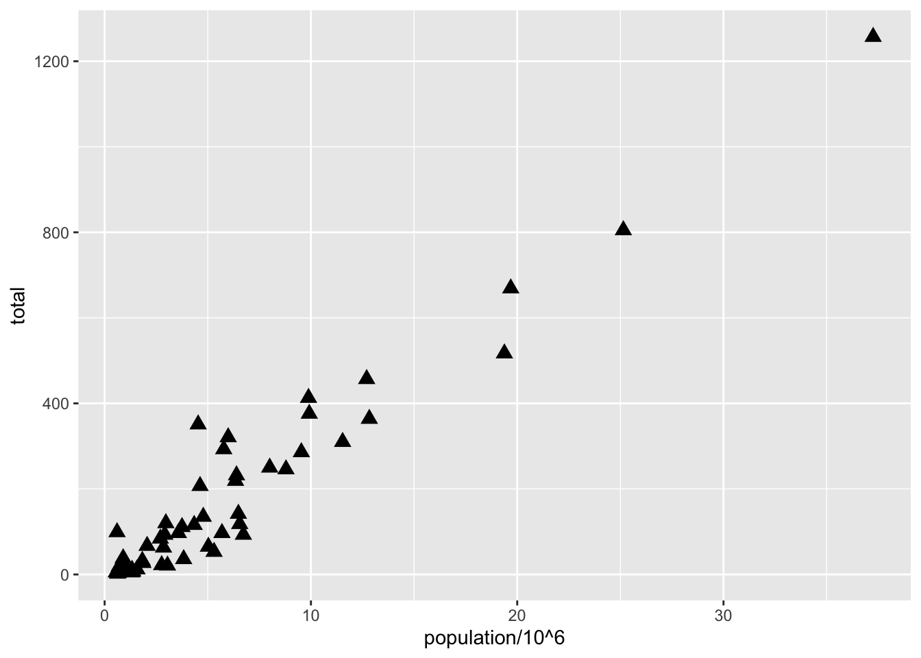
We can change the shape aesthetic to one of the many different base-R options found here:
p +geom_point(aes(x = population/10^6, y = total), size =3, shape =17)
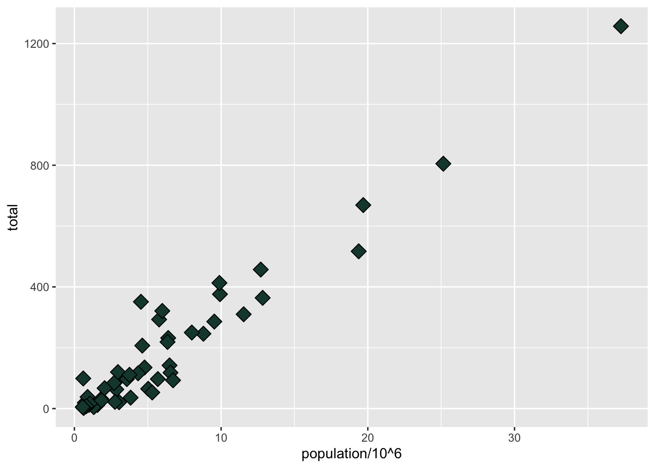
We can also change the fill and the color:
p +geom_point(aes(x = population/10^6, y = total), size =4, shape =23, fill ='#18453B')
fill can take a common name like 'green', or can take a hex color like '#18453B', which is MSU Green according to MSU’s branding site. You can also find UM Maize and OSU Scarlet on respective branding pages, or google “XXX color hex.” We’ll learn how to build a color palette later on.
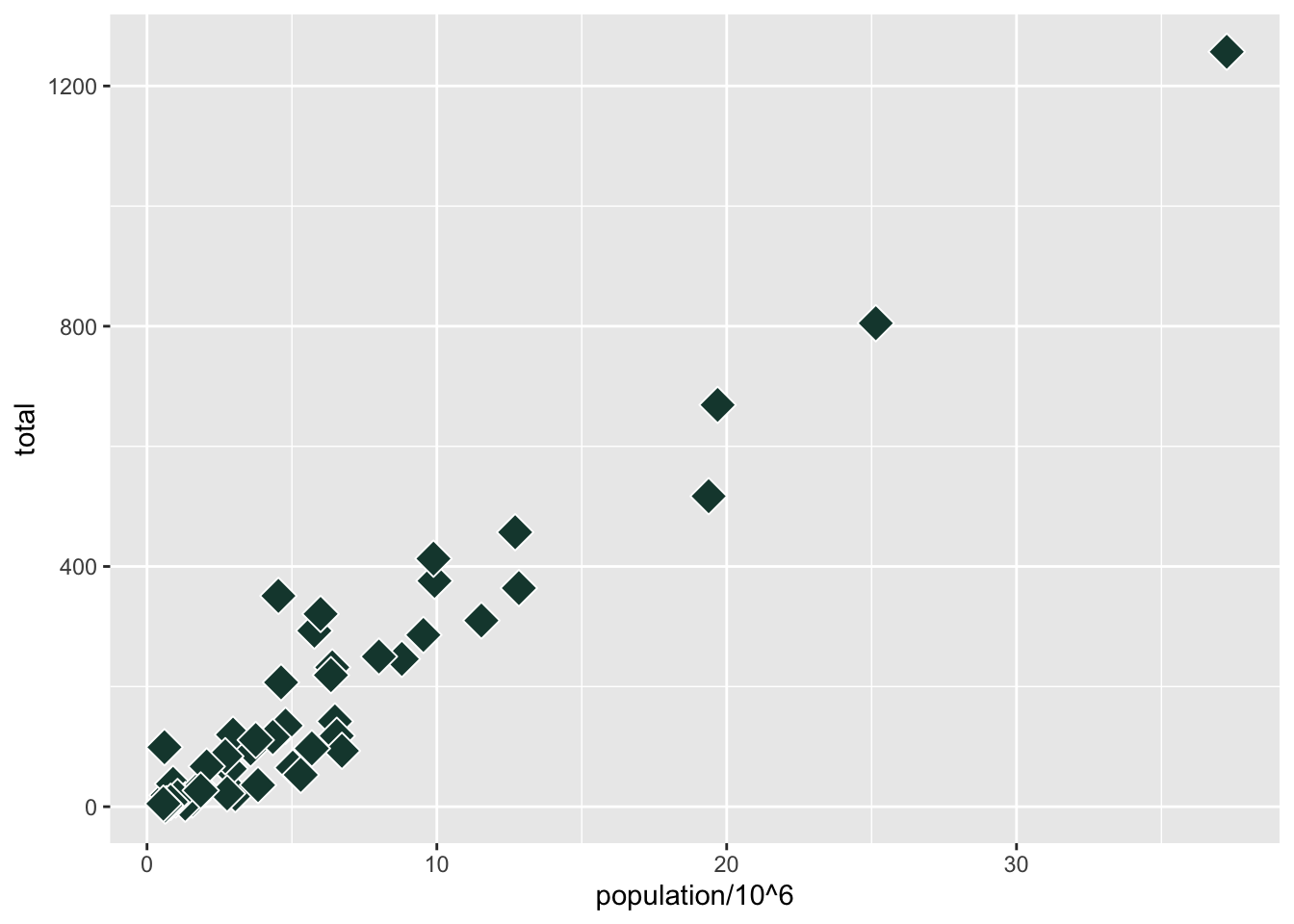
color (or colour, same thing because ggplot creators allow both spellings) is a little tricky with points - it changes the outline of the geometry rather than the fill color, but in geom_point() most shapes, including the default, have no separate fill, so color sets the whole point. This is more useful with, say, a barplot where the outline and the fill might be different colors. Still, shapes 21-25 have both fill and color:
p +geom_point(aes(x = population/10^6, y = total), size =5, shape =23, fill ='#18453B', color ='white')
The color = 'white' makes the outline of the shape white, which you can see if you look closely in the areas where the shapes overlap. This only works with shapes 21-25, or any other geometry that has both an outline and a fill.
Now, back to aesthetic mappings
Now that we’ve seen a few aesthetics (and know we can find more by looking at which aesthetics work with our geometry in the help file), let’s return to the power of aesthetic mappings.
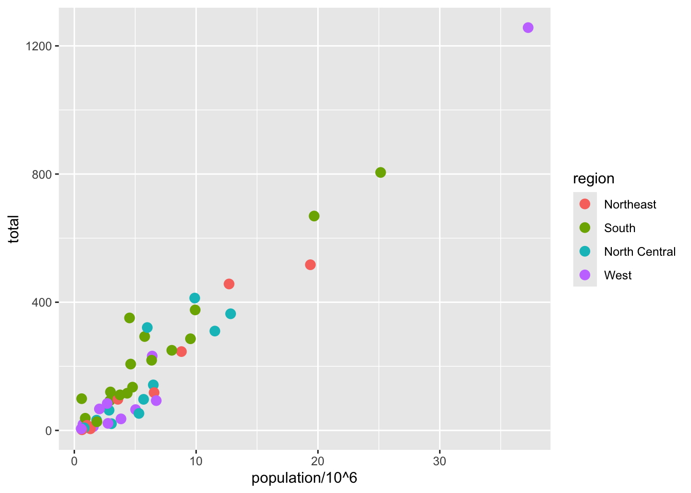
An aesthetic mapping means we can vary an aesthetic (like fill or shape or size) according to some variable in our data. This opens up a world of possibilities! Let’s try adding to our x and y aesthetics with a color aesthetic (since points respond to color better than fill) that varies by region, which is a column in our data:
p +geom_point(aes(x = population/10^6, y = total, color = region), size =3)
NoteAesthetics vs. Aesthetic mappings
Lots of features are aesthetics (color, size, etc.) but if we want to have them change according to the data, we have to use an aesthetic mapping.
We include color=regioninside the aes call, which tells R to find a variable called region and change color based on that. R will choose a somewhat ghastly color palette, and every unique value in the data for region will get a different color if the variable is discrete. If the variable is a continuous value, then ggplot will automatically make a color ramp. Thus, discrete and continuous values for aesthetic mappings work differently.
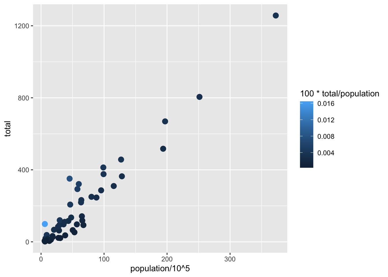
Let’s see a useful example of a continuous aesthetic mapping to color. In our data, we are making a scatterplot of population and total murders, which really just shows that states with higher populations have higher murders. What we really want is murders per capita (I think COVID taught us a lot about rates vs. levels like “cases” and “cases per 100,000 people”). We can create a variable of “murders per capita” on the fly. Since “murders per capita” is a very small number and hard to read, we’ll multiply by 100 so that we get “percent of population murdered per year”:
p +geom_point(aes(x = population/10^6, y = total, color =100*total/population), size =3)
While the clear pattern of “more population means more murders” is still there, look at the outlier in light blue in the bottom left. With the color ramp, see how easy it is to see here that there is one location where murders per capita is quite high?
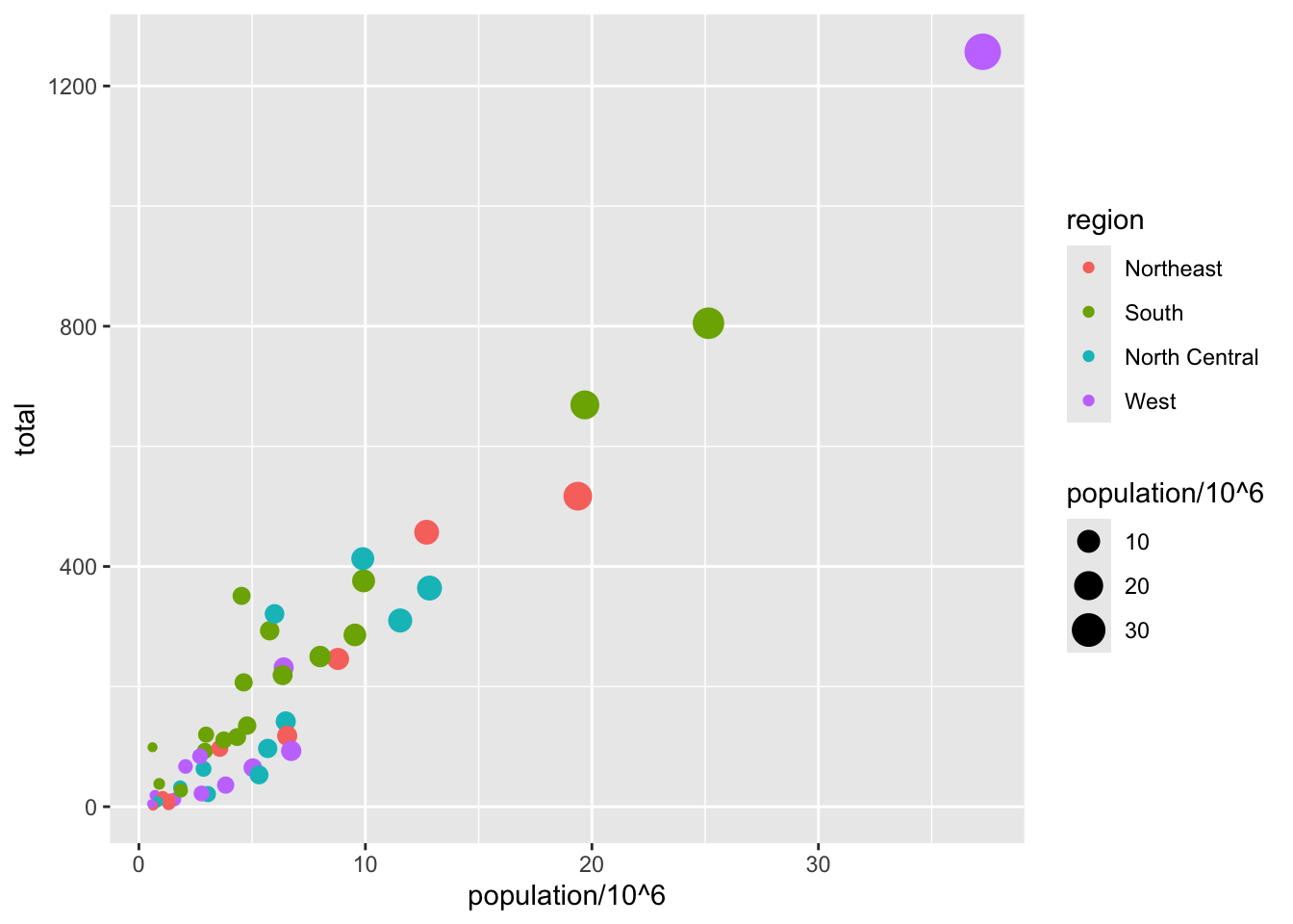
Note that size is outside of aes and is set to an explicit value, not to a variable. What if we set size to a variable in the data?
p +geom_point(aes(x = population/10^6, y = total, color = region, size = population/10^6))
Legends for aesthetics
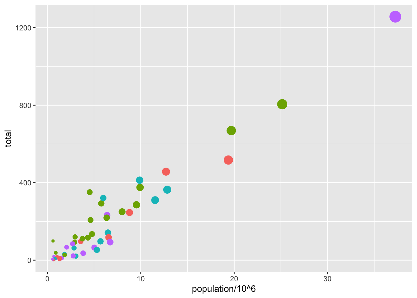
Here we see yet another useful default behavior: ggplot2 automatically adds a legend that maps color to region, and size to population (which we scaled by 1,000,000). To avoid adding this legend we set the geom_point argument show.legend = FALSE. This removes both the size and the color legend.
p +geom_point(aes(x = population/10^6, y = total, color = region, size = population/10^6), show.legend =FALSE)
Annotation Layers
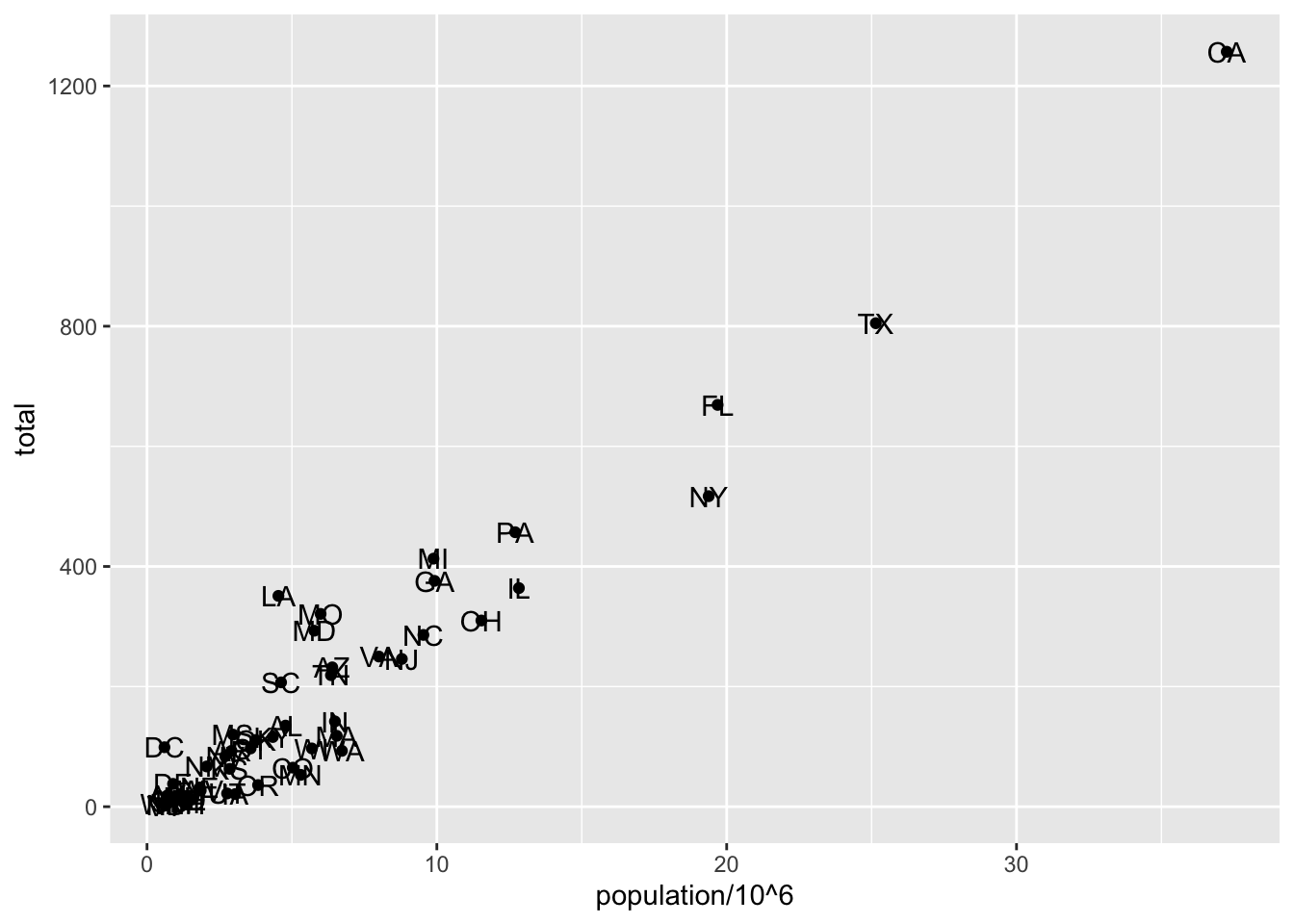
A second layer in the plot we wish to make involves adding a label to each point to identify the state. The geom_label and geom_text functions permit us to add text to the plot with and without a rectangle behind the text, respectively.
Because each point (each state in this case) has a label, we need an aesthetic mapping to make the connection between points and labels. By reading the help file ?geom_text, we learn that we supply the mapping between point and label through the label argument of aes. That is, label is an aesthetic that we can map. So the code looks like this:
p +geom_point(aes(x = population/10^6, y = total)) +geom_text(aes(x = population/10^6, y = total, label = abb))
We have successfully added a second layer to the plot.
As an example of the unique behavior of aes mentioned above, note that this call:
p +geom_point(aes(x = population/10^6, y = total)) +geom_text(aes(population/10^6, total, label = abb))
is fine, whereas this call:
p +geom_point(aes(x = population/10^6, y = total)) +geom_text(aes(population/10^6, total), label = abb)
will give you an error since abb is not found because it is outside of the aes function. The layer geom_text does not know where to find abb since it is a column name and not a global variable, and ggplot does not look for column names for non-mapped aesthetics. For a trivial example:
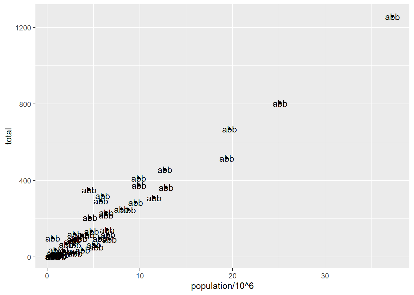
p +geom_point(aes(x = population/10^6, y = total)) +geom_text(aes(population/10^6, total), label ='abb')
Because label is set rather than mapped, every state gets the same three characters—abb—instead of its own abbreviation. That’s the tell.
Global versus local aesthetic mappings
In the previous line of code, we define the mapping aes(population/10^6, total) twice, once in each geometry. We can avoid this by using a global aesthetic mapping. We can do this when we define the blank slate ggplot object. Remember that the function ggplot contains an argument that permits us to define aesthetic mappings:
If we define a mapping in ggplot, all the geometries that are added as layers will default to this mapping. We redefine p:
p <- murders %>%ggplot(aes(x = population/10^6, y = total, label = abb))
and then we can produce our labeled scatterplot with a lot less typing:
p +geom_point(size =3) +geom_text(nudge_x =1.5) # offsets the label
We keep the size and nudge_x arguments in geom_point and geom_text, respectively, because we want to only increase the size of points and only nudge the labels. If we put those arguments in aes then they would apply to both plots. Also note that the geom_point function does not need a label argument and therefore ignores that aesthetic.
If necessary, we can override the global mapping by defining a new mapping within each layer. These local definitions override the global. Here is an example:
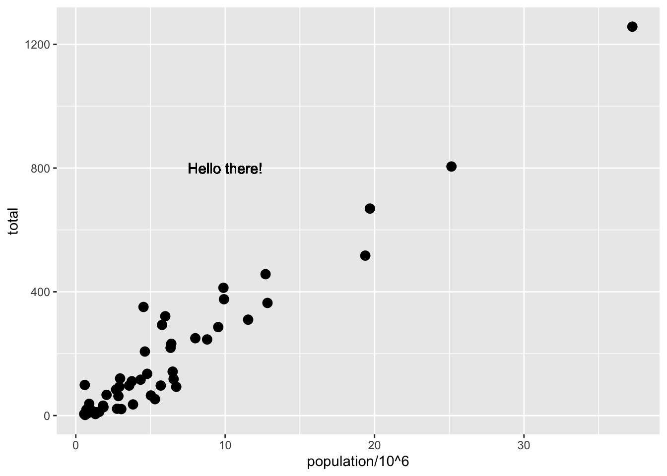
p +geom_point(size =3) +geom_text(aes(x =10, y =800, label ="Hello there!"))
Clearly, the second call to geom_text does not use x = population and y = total.
NoteTry it!
Scroll back up to the measles figure. It stops in 2011, because the data behind it stops in 2011. Two things have happened since. The US declared measles eliminated in 2000, and then, starting around 2024, measles came back.
So let’s redraw that figure with data that ends last week.
Where this data came from. CDC publishes weekly counts of every nationally notifiable disease, by state, going back to 2022, as part of the NNDSS weekly tables. I pulled the two measles rows out of it (Measles, Indigenous and Measles, Imported), threw away the regional subtotals so we’re not double-counting, and worked out weekly new cases — CDC reports a running year-to-date total, not a weekly count, which is the sort of thing you find out the hard way. It is worth knowing that this is about twenty minutes of work with an API and no special access, and we will do exactly this ourselves in Week 5.
You get state, date, year, week, new_cases (that week) and cases_ytd (running total). 52 states plus DC and New York City, January 2022 through August 2026.
First, three states
Before we do fifty-two at once, look at three. Plot date on x and new_cases on y for South Carolina, Texas and Ohio, mapping color to state, using geom_line().
Ohio has a cluster in 2023 and then nothing. Texas rumbles along through 2025. South Carolina sits flat for four years and then goes nearly vertical in January 2026.
Now the question that motivates the rest of this exercise: what happens to that plot if you take the filter out? Try it. Fifty-two lines on one set of axes is not a chart, it’s a haystack. The problem isn’t your code — it’s that a line chart gives every state the whole vertical axis, and there is only one of those.
A heatmap solves it by spending the y-axis on states instead and pushing the number into colour. That is the trade the WSJ made, and it is why their figure has fifty rows in it.
Now the heatmap
About fifteen minutes.
Same data, but now date on x, state on y, and map new_cases to the fill aesthetic with geom_tile().
Note that geom_tile takes a color argument as well. Set color = "white" so the tiles are separated. Set it, don’t map it — if you find yourself writing aes(color = ...) here, stop and ask why that’s different.
Almost every tile you have is a zero: 97% of state-weeks in this file had no measles at all, which is rather the point. Colouring all of those the same as “one case” buries the signal. Turn the zeros into missing values first, and tell the fill scale to leave missing values white:
then add scale_fill_continuous(type = 'viridis', na.value = "white").
A word on that palette. The WSJ figure at the top of this page uses a rainbow — pale blue through yellow and orange to dark red. It looks striking, and it is a bad default: a chunk of your classmates cannot reliably tell parts of it apart, and even those who can will misjudge which of two colours is “bigger”. viridis is built to avoid both problems. We will spend real time on this next week, and colourblind-friendly palettes are required on your group projects, so start now.
Right now your states are in alphabetical order, which tells the reader nothing. Use reorder() to sort them by how many cases they’ve had. (You now have NAs in that column, so you’ll need sum(x, na.rm = TRUE) inside it.)
Label it properly. Someone should be able to read the title and know what they’re looking at without you standing next to them — and say somewhere that white means no reported cases, because otherwise white reads as “missing”.
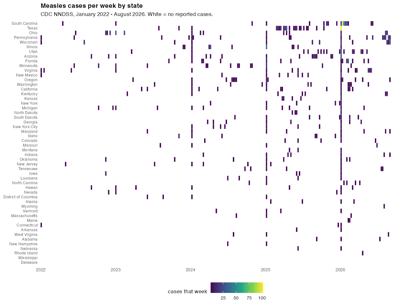
A success might look something like this:
Yours doesn’t have to match mine exactly. If your colours or proportions differ, fine — and if you found a better arrangement than I did, say so.
Then answer two questions
Because a plot that doesn’t answer anything is just decoration.
Which three states would you point at? Name them and say what’s different about each one — a single sharp burst is a different story from a long smoulder. The line plot gave you a head start on this.
Put the two figures side by side in your head. The 1928–2011 panel is a wall of red that empties out after 1963. Yours is almost entirely blank with a few bright marks. Both are pictures of the same disease. What is each one actually showing you, and which one would worry you more?
If you finish early: the old figure plots a rate per 100,000, not a count, and there’s a reason for that — we hammered this with the murders data. You do not have state populations in this file. Where would you get them, and would switching to a rate change which three states you pointed at? We come back to exactly this in Week 4, where we put the historical measles rates on a map.