library(tidyverse)
library(dslabs)
library(ggrepel)
library(ggthemes)
gapminder = dslabs::gapminder %>% as_tibble()Advanced Visualizations
Data visualization in practice
In this lecture, we will demonstrate how relatively simple ggplot2 code can create insightful and aesthetically pleasing plots. As motivation we will create plots that help us better understand trends in world health and economics. We will implement what we learned in previous sections of the class and learn how to augment the code to perfect the plots. As we go through our case study, we will describe relevant general data visualization principles.
We’re going to need the geospatial packages sf and the ever-useful tigris (for US maps), so install those if you don’t already have them.
Case study: new insights on poverty
Hans Rosling1 was the co-founder of the Gapminder Foundation2, an organization dedicated to educating the public by using data to dispel common myths about the so-called developing world. The organization uses data to show how actual trends in health and economics contradict the narratives that emanate from sensationalist media coverage of catastrophes, tragedies, and other unfortunate events. As stated in the Gapminder Foundation’s website:
Journalists and lobbyists tell dramatic stories. That’s their job. They tell stories about extraordinary events and unusual people. The piles of dramatic stories pile up in peoples’ minds into an over-dramatic worldview and strong negative stress feelings: “The world is getting worse!”, “It’s we vs. them!”, “Other people are strange!”, “The population just keeps growing!” and “Nobody cares!”
Hans Rosling conveyed actual data-based trends in a dramatic way of his own, using effective data visualization. This section is based on two talks that exemplify this approach to education: New Insights on Poverty3 and The Best Stats You’ve Ever Seen4. Specifically, in this section, we use data to attempt to answer the following two questions:
- Is it a fair characterization of today’s world to say it is divided into western rich nations and the developing world in Africa, Asia, and Latin America?
- Has income inequality across countries worsened during the last 40 years?
To answer these questions, we will be using the gapminder dataset provided in dslabs. This dataset was created using a number of spreadsheets available from the Gapminder Foundation. You can access the table like this:
Exploring the Data
Taking an exercise from the New Insights on Poverty video, we start by testing our knowledge regarding differences in child mortality across different countries. For each of the five pairs of countries below, which country do you think had the highest child mortality rates in 2015? Which pairs do you think are most similar?
- Sri Lanka or Turkey
- Poland or South Korea
- Malaysia or Russia
- Pakistan or Vietnam
- Thailand or South Africa
When answering these questions without data, the non-European countries are typically picked as having higher child mortality rates: Sri Lanka over Turkey, South Korea over Poland, and Malaysia over Russia. It is also common to assume that countries considered to be part of the developing world: Pakistan, Vietnam, Thailand, and South Africa, have similarly high mortality rates.
To answer these questions with data, we can use tidyverse functions. For example, for the first comparison we see that:
dslabs::gapminder %>%
  filter(year == 2015 & country %in% c("Sri Lanka","Turkey")) %>%
  select(country, infant_mortality)
country infant_mortality
1 Sri Lanka 8.4
2 Turkey 11.6Turkey has the higher infant mortality rate.
We can use this code on all comparisons and find the following:
Click here to reveal results.
| country | infant mortality | country | infant mortality |
|---|---|---|---|
| Sri Lanka | 8.4 | Turkey | 11.6 |
| Poland | 4.5 | South Korea | 2.9 |
| Malaysia | 6.0 | Russia | 8.2 |
| Pakistan | 65.8 | Vietnam | 17.3 |
| Thailand | 10.5 | South Africa | 33.6 |
We see that the European countries on this list have higher child mortality rates: Poland has a higher rate than South Korea, and Russia has a higher rate than Malaysia. We also see that Pakistan has a much higher rate than Vietnam, and South Africa has a much higher rate than Thailand. It turns out that when Hans Rosling gave this quiz to educated groups of people, the average score was less than 2.5 out of 5, worse than what they would have obtained had they guessed randomly. This implies that more than ignorant, we are misinformed. In this chapter we see how data visualization helps inform us by presenting patterns in the data that might not be obvious on first glance.
Slope charts
The slopechart is informative when you are comparing variables of the same type, but at different time points and for a relatively small number of comparisons. For example, comparing life expectancy between 2010 and 2015. In this case, we might recommend a slope chart.
There is no geometry for slope charts in ggplot2, but we can construct one using geom_line. We need to do some tinkering to add labels. We’ll paste together a character string with the country name and the starting life expectancy, then do the same with just the later life expectancy for the right side. Below is an example comparing 2010 to 2015 for large western countries:
west <- c("Western Europe","Northern Europe","Southern Europe",
          "Northern America","Australia and New Zealand")

dat <- gapminder %>%
  filter(year%in% c(2010, 2015) & region %in% west &
           !is.na(life_expectancy) & population > 10^7) %>%
    mutate(label_first = ifelse(year == 2010, paste0(country, ": ", round(life_expectancy, 1), ' years'), NA),
           label_last = ifelse(year == 2015,  paste0(round(life_expectancy, 1),' years'), NA))

dat %>%
  mutate(year = as.factor(year)) %>%
  ggplot(aes(year, life_expectancy, group = country)) +
  geom_line(aes(color = country), show.legend = FALSE) +
  geom_text_repel(aes(label = label_first, color = country), direction = 'y', nudge_x = -1, seed = 1234, show.legend = FALSE) +
  geom_text_repel(aes(label = label_last, color = country), direction = 'y', nudge_x =  1, seed = 1234, show.legend = FALSE) +
  xlab("") + ylab("Life Expectancy")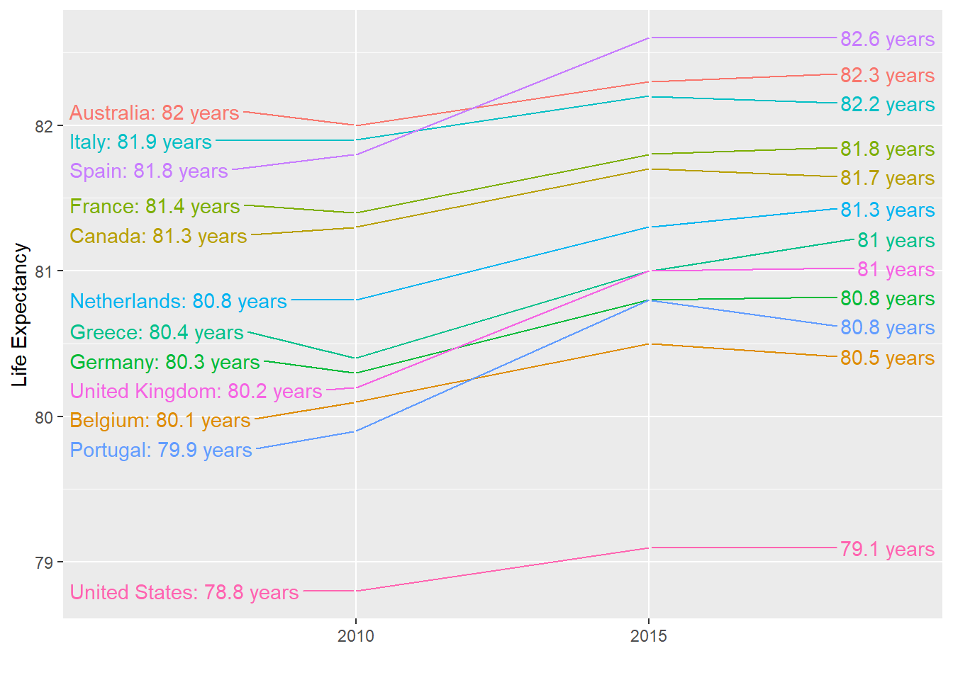
An advantage of the slope chart is that it permits us to quickly get an idea of changes based on the slope of the lines. Although we are using angle as the visual cue, we also have position to determine the exact values. Comparing the improvements is a bit harder with a scatterplot:
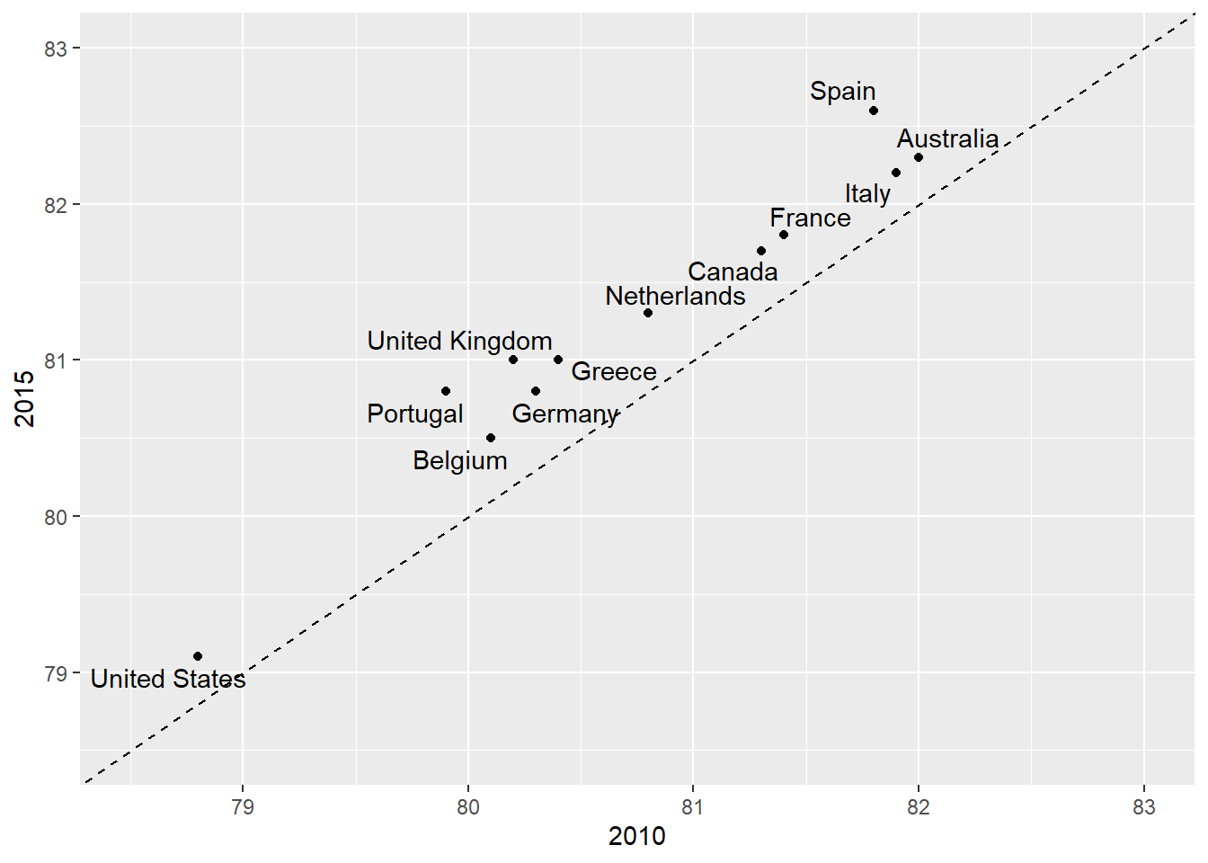
In the scatterplot, we have followed the principle use common axes since we are comparing these before and after. However, if we have many points, slope charts stop being useful as it becomes hard to see all the lines.
Bland-Altman plot
Since we are primarily interested in the difference, it makes sense to dedicate one of our axes to it. The Bland-Altman plot, also known as the Tukey mean-difference plot and the MA-plot, shows the difference versus the average:
dat %>%
  group_by(country) %>%
  filter(year %in% c(2010, 2015)) %>%
  dplyr::summarize(average = mean(life_expectancy),
                   difference = life_expectancy[year==2015]-life_expectancy[year==2010]) %>%
  ggplot(aes(average, difference, label = country)) +
  geom_point() +
  geom_text_repel() +
  geom_abline(lty = 2) +
  xlab("Average of 2010 and 2015") +
  ylab("Difference between 2015 and 2010")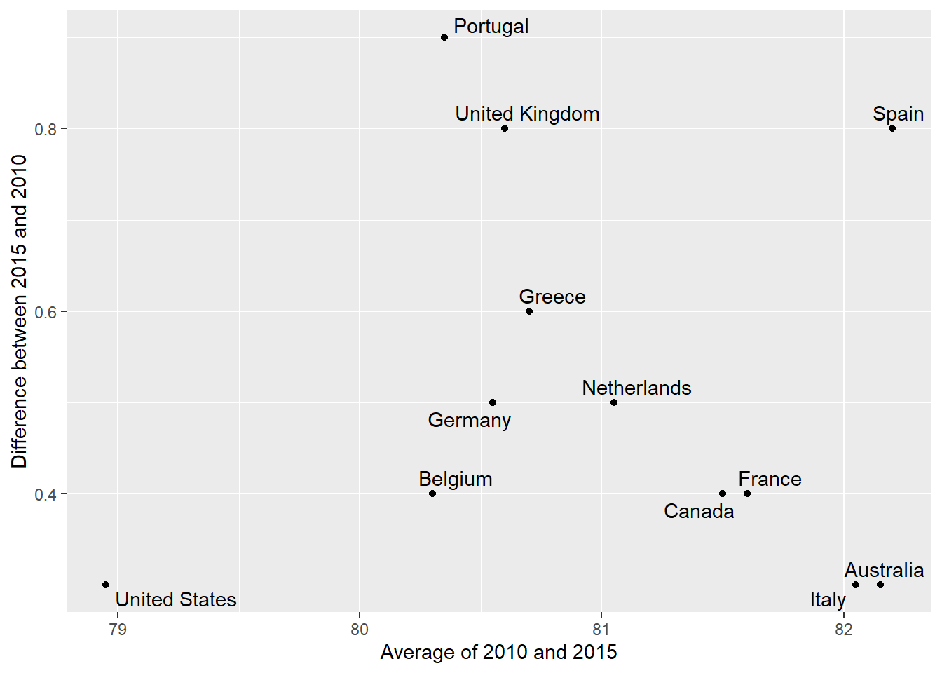
Here, by simply looking at the y-axis, we quickly see which countries have shown the most improvement. We also get an idea of the overall value from the x-axis. You already made a similar Altman plot in an earlier problem set, so we’ll move on.
Bump charts
Finally, we can make a bump chart that shows changes in rankings over time. We’ll look at fertility in South Asia. First we need to calculate a new variable that shows the rank of each country within each year. We can do this if we group by year and then use the rank() function to rank countries by the fertility column. Note that rank() counts up from the smallest value, so rank 1 is the country with the lowest fertility.
sa_fe <- gapminder %>%
  filter(region == "Southern Asia") %>%
  filter(year >= 2004, year < 2015) %>%
  group_by(year) %>%
  mutate(rank = rank(fertility))
We then plot this with points and lines, reversing the y-axis so 1 is at the top:
ggplot(sa_fe, aes(x = year, y = rank, color = country)) +
  geom_line() +
  geom_point() +
  scale_y_reverse(breaks = 1:8) +
  labs(x = "Year", y = "Rank", color = "Country")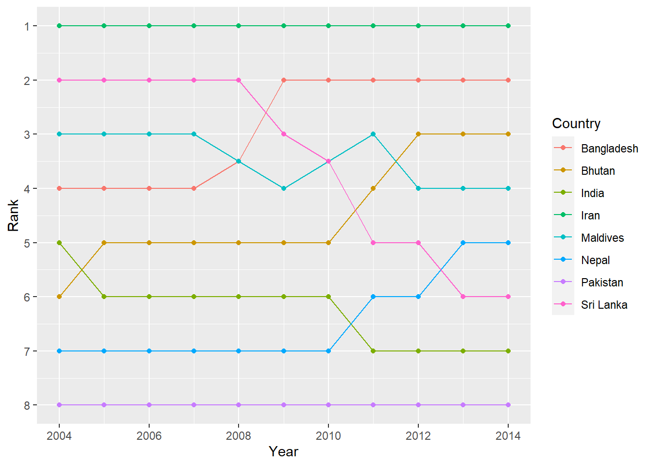
Iran holds the number 1 spot, while Sri Lanka dropped from 2 to 6, and Bangladesh increased from 4 to 2.
As with the slopegraph, there are 8 different colors in the legend and it’s hard to line them all up with the different lines, so we can plot the text directly instead. We’ll use geom_text() again. We don’t need to repel anything, since the text should fit in each row just fine. We need to change the data argument in geom_text() though and filter the data to only include one year, otherwise we’ll get labels on every point, which is excessive. We can also adjust the theme and colors to make it cleaner.
bumpplot <- ggplot(sa_fe, aes(x = year, y = rank, color = country)) +
  geom_line(size = 2) +
  geom_point(size = 4) +
  geom_text(data = sa_fe %>% dplyr::filter(year==2004) %>% arrange(rank),
            aes(label = country, x = 2003), fontface = "bold", angle = 45) +
 geom_text(data = sa_fe %>% dplyr::filter(year==2014) %>% arrange(rank),
            aes(label = country, x = 2015), fontface = "bold", angle = 45) +
  guides(color = 'none') + # another way of turning off legend
  scale_y_reverse(breaks = 1:8) +
  scale_x_continuous(breaks = 2004:2014) +
  scale_color_viridis_d(option = "C", begin = 0.2, end = 0.9) +
  labs(x = NULL, y = "Rank") +
  theme(plot.margin = unit(c(0.5, 0.5, 0.5, 0.5),  "inches"))

bumpplot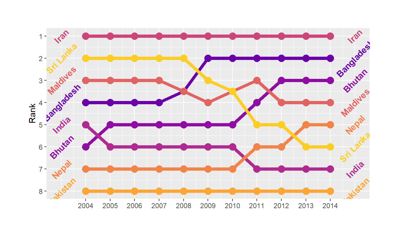
Themes
We can go a little further towards a clean, easy-to-read data visualization by using themes in our plots. Themes allow us to set a particular range of plot settings in one command, and let us further tweak things like fonts, background colors, and much more. We’ve used them in passing a few times without highlighting them, but we’ll discuss them here.
A pre-constructed set of instructions for making a visual theme can be had by adding one of ggplot2’s theme_*() functions to your plot. Let’s look at two of my favorites.
theme_bw() uses the black-and-white theme, which is helpful in making a nice, clean plot:
bumpplot + theme_bw()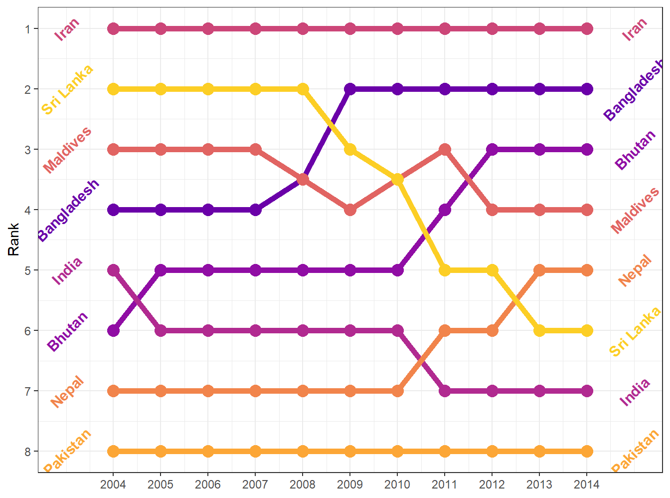
The background shading is gone, which gives the plot a nice, crisp feel. It adds the black outline around the plot, but doesn’t mess with the colors in the plot.
Here’s theme_minimal()
bumpplot + theme_minimal()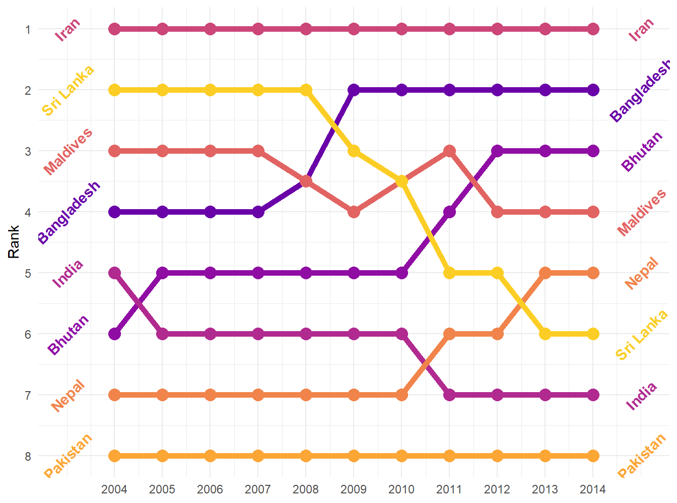
Themes can alter things in the plot as well. If we really want to strip it down and remove the axes, gridlines, and background entirely (which is rarely a good idea, but in a bump chart, it makes sense):
bumpplot + theme_void()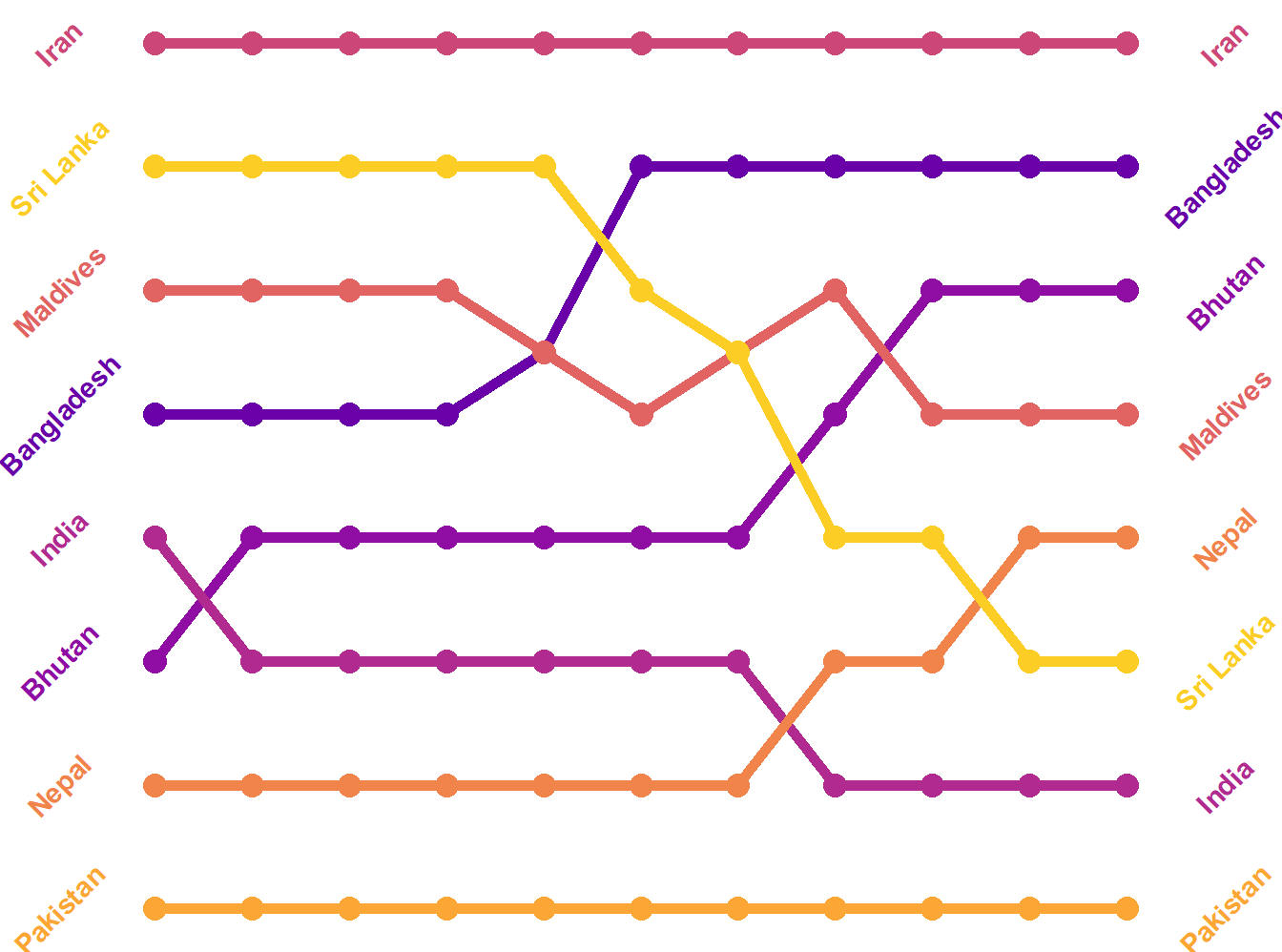
Now that’s clean!
In our opening unit, we had a plot that was styled after the plots in the magazine, The Economist. That’s a theme (in the ggthemes package that we loaded at the top)!
bumpplot + theme_economist()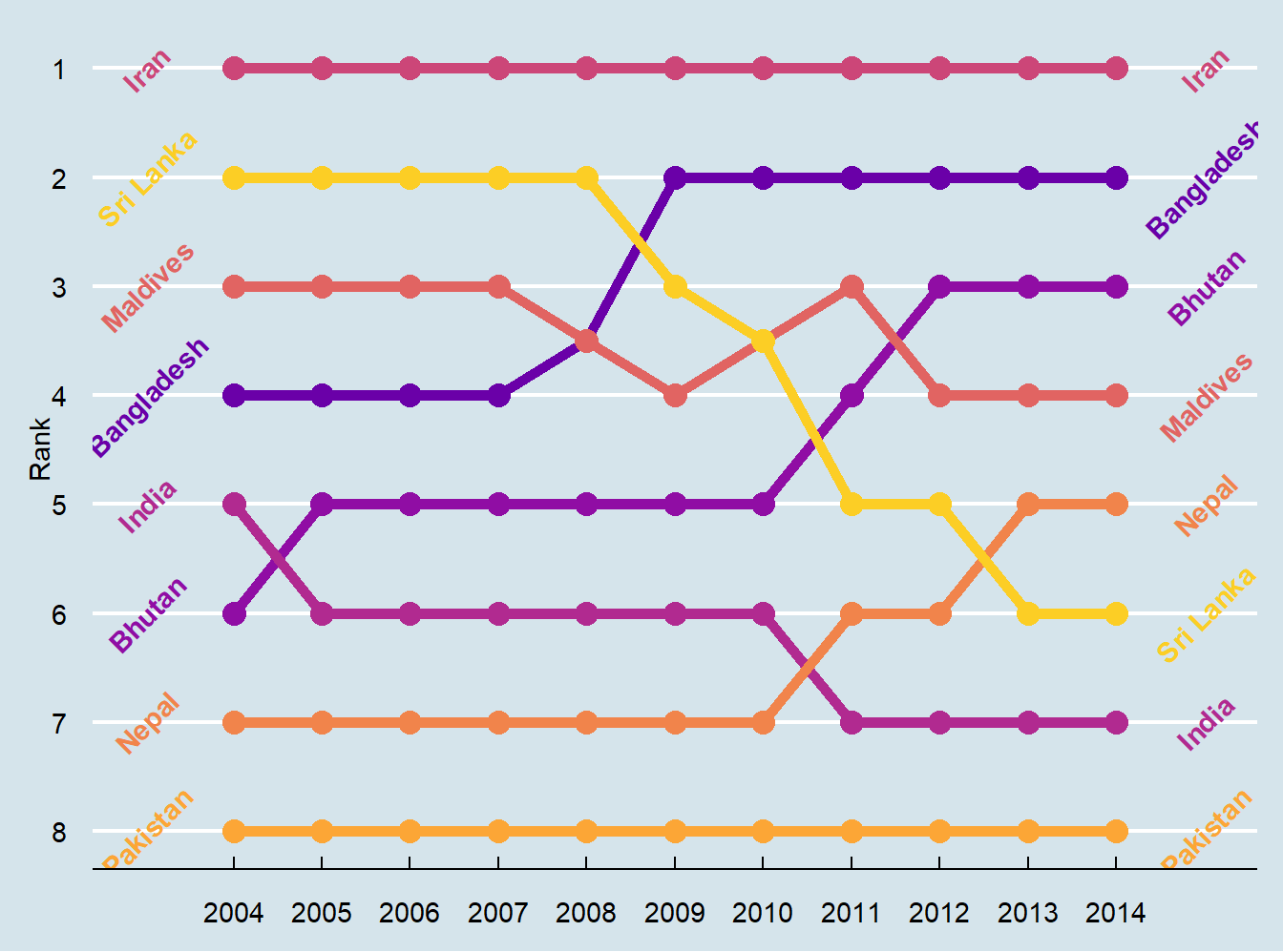
Themes affect some of the plot elements that we haven’t gotten much into (like length of axis ticks and the color of the panel grid behind the plot). We can use a theme, then make further changes to the theme. We won’t go into a lot of detail, but here’s an example. Use the ?theme to learn more about what you can change. Half the challenge is finding the right term for the thing you want to tweak! Theme changes occur in code order, so you can update a pre-set theme with your own details:
bumpplot +   theme_bw() + theme(strip.text = element_text(face = "bold"),
                   plot.title = element_text(face = "bold"),
                   axis.text.x = element_text(angle = 45, hjust = 1),
                   panel.grid.major.y = element_blank(), # turn off all of the Y grid
                   panel.grid.minor.y = element_blank(),
                   panel.grid.minor.x = element_blank()) # turn off small x grid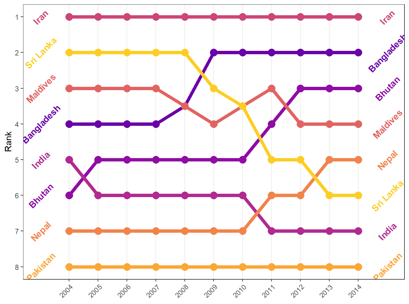
Theme elements
The above code looks a little odd in that asking it to leave out the minor and major Y grid, and the minor X grid, required element_blank(), a function! Since a “blank” part (or a solid color part) might entail a lot of particular things, the ggplot function is necessary here to take care of all the particular details.
Relatedly, if we wanted to change the background color of some panel (the plotted area), then element_rect() would be used because the panel is a rectangle. The theme argument would be panel.background =element_rect(fill="red") if we wanted to make it red (and hideous)
bumpplot +   theme_bw() + theme(strip.text = element_text(face = "bold"),
                                panel.background  = element_rect(fill='red'),
                   plot.title = element_text(face = "bold"),
                   axis.text.x = element_text(angle = 45, hjust = 1),
                   panel.grid.major.y = element_blank(), # turn off all of the Y grid
                   panel.grid.minor.y = element_blank(),
                   panel.grid.minor.x = element_blank()) # turn off small x grid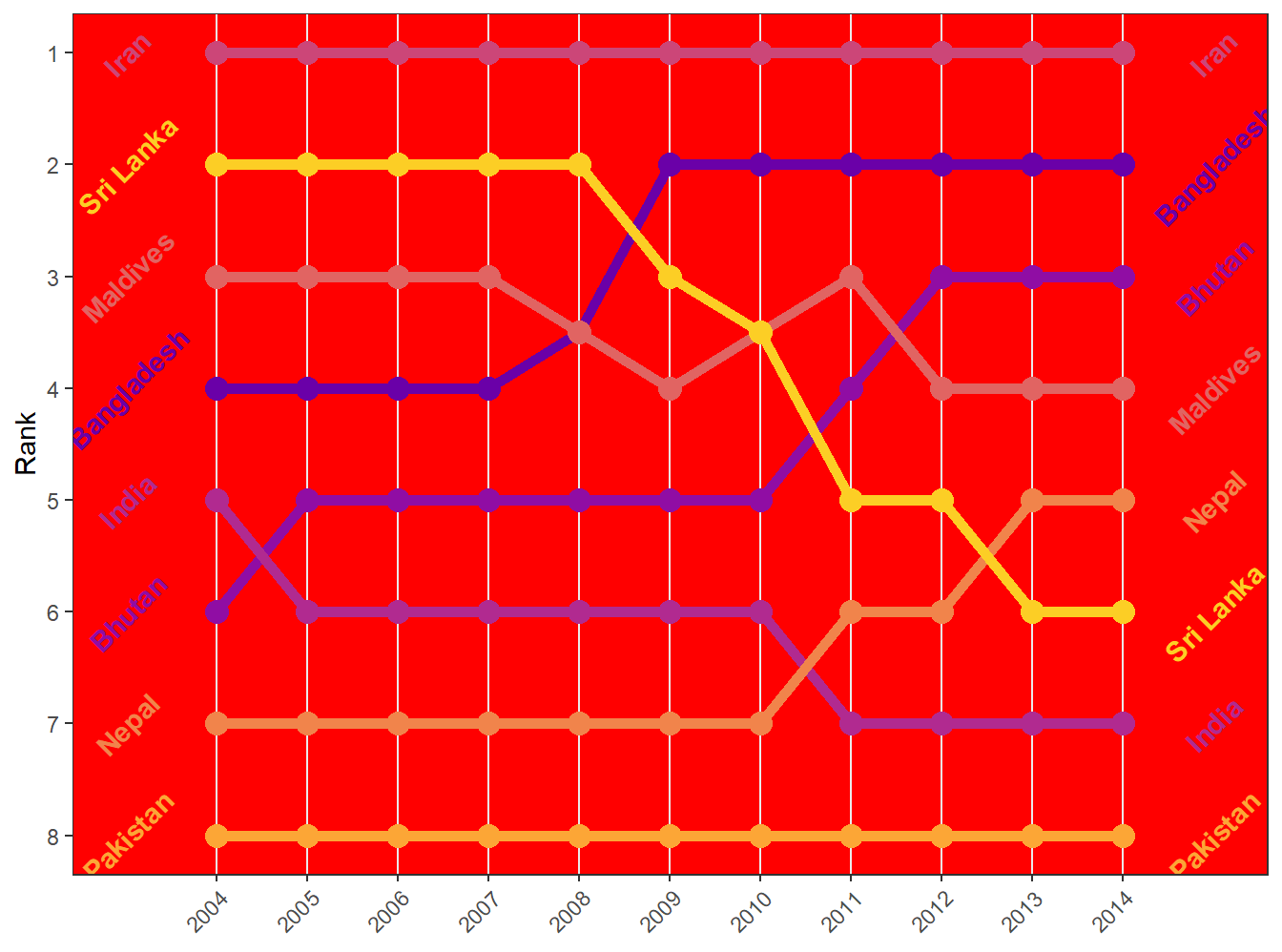
We can also set the strip.background for the “strip” rectangles that label our facet_wrap and facet_grid sections, and plot.background for the area behind the plot panel.
In the above example, we also set the element_text function for the axis text and specified a rotation (see the years are at 45 degrees) and a horizontal-adjustment (hjust = 1) so that the end of each label sits at its tick mark instead of sliding past it. element_text is a theme element that controls how the text looks (including font, face, color, etc). This is particularly useful when you have appropriate axis labels that might be long, like the scales::label_comma from last week. We can avoid scrunching our labels by using element_text to set a new angle (45 or 90).
Case study: vaccines and infectious diseases
Vaccines have helped save millions of lives. In the 19th century, before herd immunization was achieved through vaccination programs, deaths from infectious diseases, such as smallpox and polio, were common. However, today vaccination programs have become somewhat controversial despite all the scientific evidence for their importance.
The controversy started with a paper5 published in 1998 and led by Andrew Wakefield claiming there was a link between the administration of the measles, mumps, and rubella (MMR) vaccine and the appearance of autism and bowel disease. Despite much scientific evidence contradicting this finding, sensationalist media reports and fear-mongering from conspiracy theorists led parts of the public into believing that vaccines were harmful. As a result, many parents ceased to vaccinate their children. This dangerous practice can be potentially disastrous given that the Centers for Disease Control (CDC) estimates that vaccinations will prevent more than 21 million hospitalizations and 732,000 deaths among children born in the last 20 years (see Benefits from Immunization during the Vaccines for Children Program Era — United States, 1994-2013, MMWR6). The 1998 paper has since been retracted and Andrew Wakefield was eventually “struck off the UK medical register, with a statement identifying deliberate falsification in the research published in The Lancet, and was thereby barred from practicing medicine in the UK.” (source: Wikipedia7). Yet misconceptions persist, in part due to self-proclaimed activists who continue to disseminate misinformation about vaccines.
Effective communication of data is a strong antidote to misinformation and fear-mongering. Earlier we used an example provided by a Wall Street Journal article8 showing data related to the impact of vaccines on battling infectious diseases. Here we reconstruct that example.
The data used for these plots were collected, organized, and distributed by the Tycho Project9. They include weekly reported counts for seven diseases from 1928 to 2011, from all fifty states. The yearly totals are helpfully included in the dslabs package:
library(RColorBrewer)
data(us_contagious_diseases)
names(us_contagious_diseases)
[1] "disease" "state" "year" "weeks_reporting"
[5] "count" "population" We create a temporary object dat that stores only the measles data, includes a per 10,000 rate, orders states by average value of disease and removes Alaska and Hawaii since they only became states in the late 1950s. Note that there is a weeks_reporting column that tells us for how many weeks of the year data was reported. We have to adjust for that value when computing the rate.
the_disease <- "Measles"
dat <- us_contagious_diseases %>%
  filter(!state%in%c("Hawaii","Alaska") & disease == the_disease) %>%
  mutate(rate = count / population * 10000 * 52 / weeks_reporting) %>%
  mutate(state = reorder(state, rate))
We can now easily plot disease rates per year. Here are the measles data from California:
dat %>% filter(state == "California" & !is.na(rate)) %>%
  ggplot(aes(year, rate)) +
  geom_line() +
  ylab("Cases per 10,000")  +
  geom_vline(xintercept=1963, col = "blue")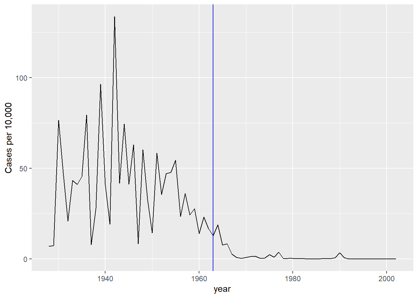
We add a vertical line at 1963 since this is when the vaccine was introduced [Control, Centers for Disease; Prevention (2014). CDC health information for international travel 2014 (the yellow book). p. 250. ISBN 9780199948505].
Now can we show data for all states in one plot? We have three variables to show: year, state, and rate. In the WSJ figure, they use the x-axis for year, the y-axis for state, and color hue to represent rates. However, the color scale they use, which goes from yellow to blue to green to orange to red, can be improved.
In our example, we want to use a sequential palette since there is no meaningful center, just low and high rates.
We use the geometry geom_tile to tile the region with colors representing disease rates. We use a square root transformation to avoid having the really high counts dominate the plot. Notice that missing values are shown in grey. Note that once a disease was pretty much eradicated, some states stopped reporting cases altogether. This is why we see so much grey after 1980.
dat %>%
  mutate(state = factor(state, levels = rev(levels(state)[order(levels(state))]))) %>%
  ggplot(aes(year, state, fill = rate)) +
  geom_tile(color = "grey50") +
  scale_x_continuous(expand=c(0,0)) +
  scale_fill_gradientn(colors = brewer.pal(9, "Reds"), trans = "sqrt") +
  geom_vline(xintercept=1963, col = "blue") +
  theme_minimal() +
  theme(panel.grid = element_blank(),
        legend.position="bottom",
        text = element_text(size = 8)) +
  ggtitle(the_disease) +
  ylab("") + xlab("")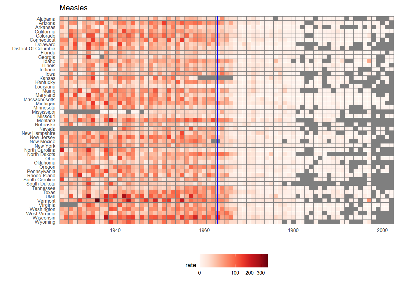
This plot makes a very striking argument for the contribution of vaccines. However, one limitation of this plot is that it uses color to represent quantity, which we earlier explained makes it harder to know exactly how high values are going. Position and lengths are better cues. If we are willing to lose state information, we can make a version of the plot that shows the values with position. We can also show the average for the US, which we compute like this:
avg <- us_contagious_diseases %>%
  filter(disease==the_disease) %>% group_by(year) %>%
  summarize(us_rate = sum(count * 52 / weeks_reporting, na.rm = TRUE) /
              sum(population, na.rm = TRUE) * 10000)
Now to make the plot we simply use the geom_line geometry:
dat %>%
  filter(!is.na(rate)) %>%
    ggplot() +
  geom_line(aes(year, rate, group = state),  color = "grey50",
            show.legend = FALSE, alpha = 0.2, size = 1) +
  geom_line(mapping = aes(year, us_rate),  data = avg, size = 1) +
  scale_y_continuous(trans = "sqrt", breaks = c(5, 25, 125, 300)) +
  ggtitle("Cases per 10,000 by state") +
  xlab("") + ylab("") +
  geom_text(data = data.frame(x = 1955, y = 50),
            mapping = aes(x, y, label="US average"),
            color="black") +
  geom_vline(xintercept=1963, col = "blue")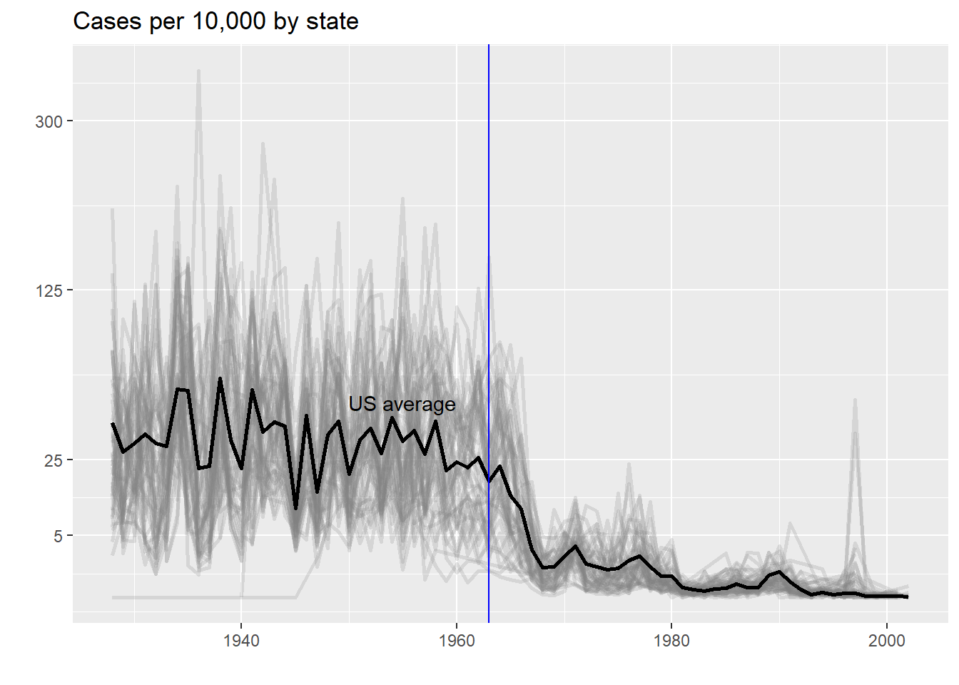
In theory, we could use color to represent the categorical value state, but it is hard to pick 50 distinct colors.
Saving your plot
In RMarkdown, we display the plot as part of the chunk output. For your group project (or for future use) you’ll likely need to save your plot as well. The function ggsave is a good way of outputting your plot.
ggsave(myPlot, file = 'myPlot.png', width = 7, height = 5, dpi=300)File type will be discerned from the suffix on the file, and the height and width are in inches. The dpi argument sets the pixels-per-inch. Generally, screens display at around 150 (though this is rapidly increasing, it used to be 72 dpi), and print is usually 300 or better. A width of 5 inches at 300 dpi will render an image 1,500 pixels across.
The dpi and file size may change the relative font size, so you might have to experiment with different sizes and dpi values for exporting.
NoteTRY IT
Reproduce the heatmap plot we previously made but for smallpox. For this plot, include only years with 10 or more weeks reporting.
Now reproduce the time series plot we previously made, but this time following the instructions of the previous question for smallpox.
For the state of California, make a time series plot showing rates for all diseases. Include only years with 10 or more weeks reporting. Use a different color for each disease.
Now do the same for the rates for the US. Hint: compute the US rate by using summarize: the total divided by total population.
Geospatial visualization
Note: I assume you have met the pre-requisites for this course, which includes PLS202. PLS202 covers the basics of geospatial in R using the sf package. If you are unfamiliar or need a review, I have a short lesson (that used to be part of our course material before PLS202 started including it) located in a resource here
In the measles case, it might be nice to examine measles rates on a map. Maybe there’s something regional about vaccine rollout? Or maybe we think there might be spillovers between states (measles is incredibly highly contagious).
We’ll need tigris, which accesses US census TIGER/line files which define nearly all federally-recognized boundaries, from states to counties and territories, to US census tracts and blocks. Today we’ll work only with US states, since that’s the level of granularity at which our measles data is reported (that is, we don’t see e.g. county-level measles cases).
library(sf)
library(tigris)
geom_sf()
Lucky for us, a sf object is all we need to make a nice visual map. The sf object is just a tidyverse tbl that has a special column, the geometry column, that gives the geospatial location and shape (polygon or point or line) that corresponds to that data.
Let’s map the rate we used in the heatmap above. Since we have many years of observations, let’s use 1960 (before the vaccine) and 1965 (2 years after the vaccine).
states = tigris::states(progress_bar = F)
# progress_bar = F just keeps the function from putting out a progress bar, which takes up output space
# probably use it on your projects, but not necessary for interactive.

head(states)
## Simple feature collection with 6 features and 15 fields
## Geometry type: MULTIPOLYGON
## Dimension:     XY
## Bounding box:  xmin: -97.23909 ymin: 24.39631 xmax: -71.08857 ymax: 49.38448
## Geodetic CRS:  NAD83
##   REGION DIVISION STATEFP  STATENS GEOID     GEOIDFQ STUSPS          NAME LSAD
## 1      3        5      54 01779805    54 0400000US54     WV West Virginia   00
## 2      3        5      12 00294478    12 0400000US12     FL       Florida   00
## 3      2        3      17 01779784    17 0400000US17     IL      Illinois   00
## 4      2        4      27 00662849    27 0400000US27     MN     Minnesota   00
## 5      3        5      24 01714934    24 0400000US24     MD      Maryland   00
## 6      1        1      44 01219835    44 0400000US44     RI  Rhode Island   00
##   MTFCC FUNCSTAT        ALAND      AWATER    INTPTLAT     INTPTLON
## 1 G4000        A  62266513826   488918898 +38.6472854 -080.6183274
## 2 G4000        A 138965379385 45968913048 +28.3989775 -082.5143005
## 3 G4000        A 143778206717  6216848695 +40.1028754 -089.1526108
## 4 G4000        A 206244791203 18937236061 +46.3159573 -094.1996043
## 5 G4000        A  25151223822  6979843236 +38.9466584 -076.6744939
## 6 G4000        A   2677768885  1323681453 +41.5964850 -071.5264901
##                         geometry
## 1 MULTIPOLYGON (((-77.75438 3...
## 2 MULTIPOLYGON (((-83.10874 2...
## 3 MULTIPOLYGON (((-87.89243 3...
## 4 MULTIPOLYGON (((-95.31991 4...
## 5 MULTIPOLYGON (((-75.756 39....
## 6 MULTIPOLYGON (((-71.67881 4...
ggplot(states) + geom_sf()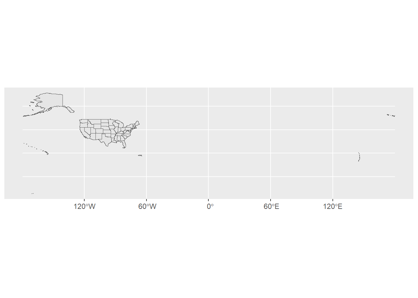
We get a lot of information besides the geometry column, including the census REGION and DIVISION, plus the STATEFP, which is the “state FIPS code” for each state. These are unique numbers for each state that are used in federal data. We’ll use them more in the future.
We also get all the territories, which extends the map window way out into the South Pacific. Let’s use some tricks to make this better. First off, US territories have FIPS codes of 60 and above, so we can filter to get the 50 US States + DC. Then, we can shift the geometry to include AK and HI (not to scale).
states = tigris::states(cb = T, progress_bar = F) %>%
  dplyr::filter(STATEFP<60) %>%
  tigris::shift_geometry(position = 'below') %>%
  dplyr::select(STATEFP, STUSPS, NAME)

head(states)
## Simple feature collection with 6 features and 3 fields
## Geometry type: MULTIPOLYGON
## Dimension:     XY
## Bounding box:  xmin: -2356114 ymin: -782290.7 xmax: 1419556 ymax: 970427.9
## Projected CRS: USA_Contiguous_Albers_Equal_Area_Conic
##   STATEFP STUSPS         NAME                       geometry
## 1      35     NM   New Mexico MULTIPOLYGON (((-1231344 -5...
## 2      46     SD South Dakota MULTIPOLYGON (((-633765.6 8...
## 3      06     CA   California MULTIPOLYGON (((-2066923 -2...
## 4      21     KY     Kentucky MULTIPOLYGON (((584560 -886...
## 5      01     AL      Alabama MULTIPOLYGON (((760323.7 -7...
## 6      13     GA      Georgia MULTIPOLYGON (((1390722 -58...

ggplot(states) + geom_sf() + theme_minimal()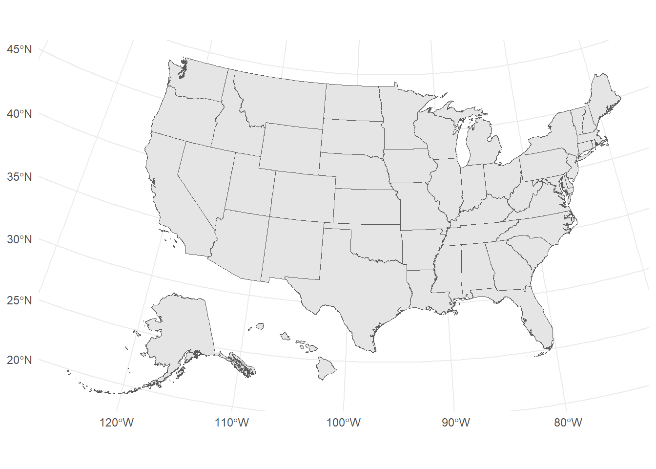
Just a note: we selected only 3 columns, but R (rather, the sf package) kept the geometry column automatically! That’s a feature of sf – it won’t let you drop that important column unless you specifically tell it to.
Now we need to join our measles data to our map. We’re covering join in the next lecture, so we’ll keep it simple here. Note that we’re joining dat to the states object using a key of NAME.
measles.to.merge.1960 = dat %>% dplyr::filter(year==1960) %>% dplyr::select(rate, NAME = state)
# Note: I re-named state-->NAME so it matches our states column name
#
measles.to.merge.1965 = dat %>% dplyr::filter(year==1965) %>% dplyr::select(rate, NAME = state)


states.measles.1960 = left_join(x = states,
                                y = measles.to.merge.1960,
                                by = 'NAME')

states.measles.1965 = left_join(x = states,
                                y = measles.to.merge.1965,
                                by = 'NAME')

head(states.measles.1960)
Simple feature collection with 6 features and 4 fields
Geometry type: MULTIPOLYGON
Dimension: XY
Bounding box: xmin: -2356114 ymin: -782290.7 xmax: 1419556 ymax: 970427.9
Projected CRS: USA_Contiguous_Albers_Equal_Area_Conic
STATEFP STUSPS NAME rate geometry
1 35 NM New Mexico 35.5406757 MULTIPOLYGON (((-1231344 -5...
2 46 SD South Dakota 7.6412829 MULTIPOLYGON (((-633765.6 8...
3 06 CA California 14.1386471 MULTIPOLYGON (((-2066923 -2...
4 21 KY Kentucky 37.4937418 MULTIPOLYGON (((584560 -886...
5 01 AL Alabama 6.8812231 MULTIPOLYGON (((760323.7 -7...
6 13 GA Georgia 0.8176275 MULTIPOLYGON (((1390722 -58...Alright, we now have two geospatial objects, one for 1960, one for 1965. Let’s make the plots and take a peek at 1960:
p.1960 = ggplot(states.measles.1960, aes(fill = rate)) +
  geom_sf() +
  scale_fill_continuous(type = 'viridis') +
  labs(fill = 'Measles Rate', title = 'Measles - 1960') +
  theme_void() +# really get rid of the extra stuff
  theme(legend.position = "bottom")

p.1960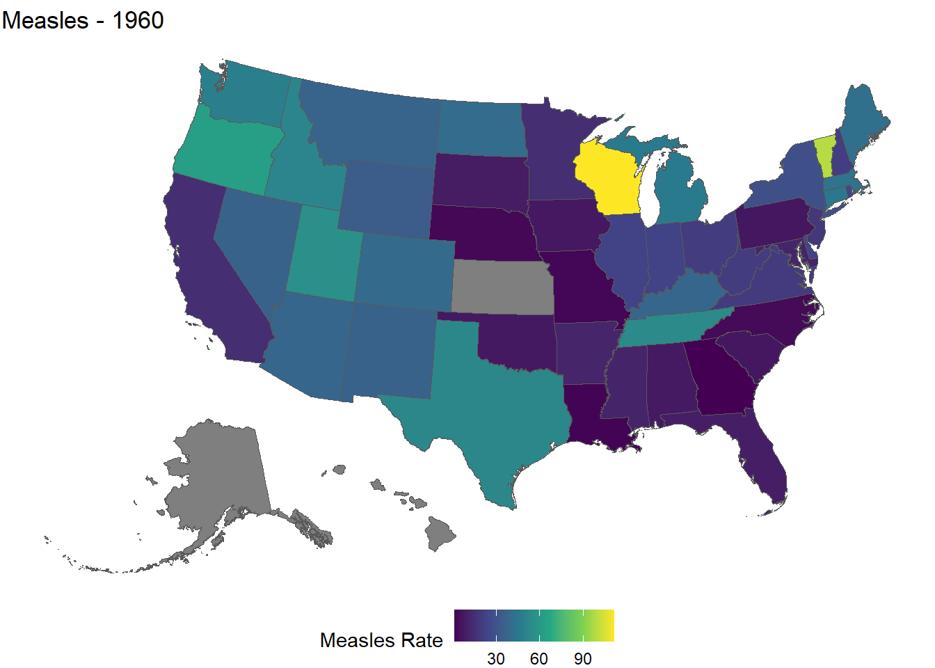
A couple things to note in this code:
- We use the
fillaesthetic mapping, so the state borders still have the default forcolor - Kansas, Alaska, and Hawaii are
NAfor 1960 – and so is DC, becausedslabsspells it “District Of Columbia” whiletigrisspells it “District of Columbia”, so the join silently misses it - We set the theme to
theme_void()and then use anothertheme()function to move the legend. Think of it as overwriting the previous theme.
Finally, let’s put the years side-by-side:
library(gridExtra)
library(patchwork)

p.1965 = ggplot(states.measles.1965, aes(fill = rate)) +
  geom_sf() +
  scale_fill_continuous(type = 'viridis') +
  labs(fill = 'Measles Rate', title = 'Measles - 1965') +
  theme_void() +# really get rid of the extra stuff
  theme(legend.position = "bottom")

p.1960 + p.1965 # this is patchwork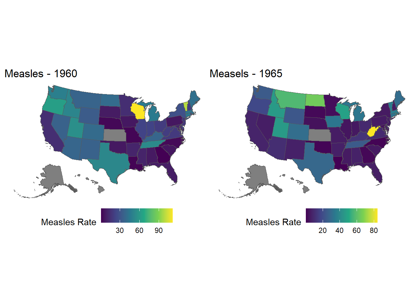
NoteTRY IT
There’s something wrong (or, at the very least, unhelpful) about the finished measles plot above. Can anyone guess what it is?
And can anyone fix it?
Footnotes
https://en.wikipedia.org/wiki/Hans_Rosling↩︎
http://www.gapminder.org/↩︎
https://www.ted.com/talks/hans_rosling_reveals_new_insights_on_poverty?language=en↩︎
https://www.ted.com/talks/hans_rosling_shows_the_best_stats_you_ve_ever_seen↩︎
http://www.thelancet.com/journals/lancet/article/PIIS0140-6736(97)11096-0/abstract↩︎
https://www.cdc.gov/mmwr/preview/mmwrhtml/mm6316a4.htm↩︎
https://en.wikipedia.org/wiki/Andrew_Wakefield↩︎
http://graphics.wsj.com/infectious-diseases-and-vaccines/↩︎
http://www.tycho.pitt.edu/↩︎