library(tidyverse)
AAPLNFLX <- read_csv('https://ec242.netlify.app/data/AAPLNFLX.csv')Visualizations in Practice
Readings
- This page.
Guiding Questions
- Today we’re mostly learning some technical aspects of
ggplot. - Why are we covering the material this way? (Good question. There’s an answer!)
Line plots
AAPLNFLX holds the daily closing price of two stocks, Apple and Netflix, from January through July 2021.1
head(AAPLNFLX)# A tibble: 6 × 8
symbol date open high low close volume adjusted
<chr> <date> <dbl> <dbl> <dbl> <dbl> <dbl> <dbl>
1 AAPL 2021-01-04 134. 134. 127. 129. 143301900 126.
2 AAPL 2021-01-05 129. 132. 128. 131. 97664900 127.
3 AAPL 2021-01-06 128. 131. 126. 127. 155088000 123.
4 AAPL 2021-01-07 128. 132. 128. 131. 109578200 127.
5 AAPL 2021-01-08 132. 133. 130. 132. 105158200 128.
6 AAPL 2021-01-11 129. 130. 128. 129. 100384500 125.For a good old line plot, we use the line geometry at geom_line. The help for ?geom_line tells us that we need an x and a y aesthetic (much like geom_point). We want this to be a time series, so the x-axis will be the date and the y-axis will be the closing price. Apple first:
AAPL <- AAPLNFLX %>% filter(symbol == "AAPL")
ggplot(AAPL, aes(x = date, y = close)) +
  geom_line() +
  labs(x = 'Date', y = 'Closing price', title = 'Apple stock price')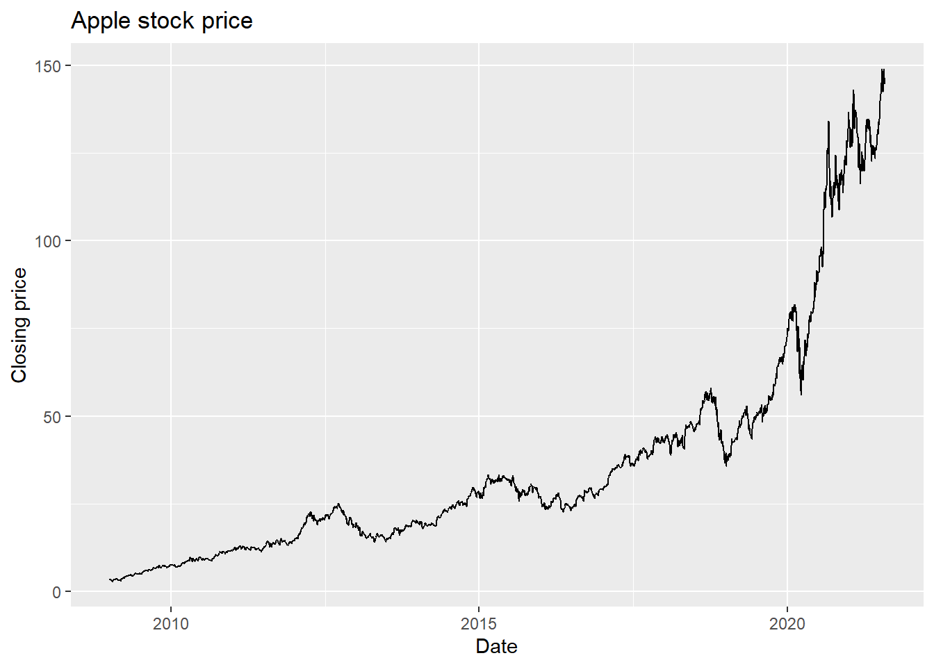
Let’s see an example with two stocks:
ggplot(AAPLNFLX, aes(x = date, y = close)) +
  geom_line() +
  labs(x = 'Date', y = 'Closing price', title = 'Apple and Netflix stock price')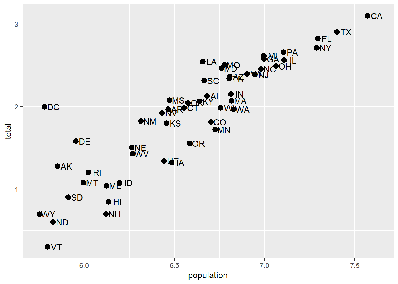
Try it: make it one line per stock.
Look at one day:
AAPLNFLX %>% filter(date == as.Date('2021-03-01'))# A tibble: 2 × 8
symbol date open high low close volume adjusted
<chr> <date> <dbl> <dbl> <dbl> <dbl> <dbl> <dbl>
1 AAPL 2021-03-01 124. 128. 123. 128. 116307900 124.
2 NFLX 2021-03-01 54.6 55.2 54.2 55.1 30414000 55.1Two rows for one date. In geom_line, R will automatically sort on the x-variable. If you don’t want this, then geom_path will use whatever order the data is in. Either way, if you have multiple observations for the same value on the x-axis, then you’ll get something pretty messy because R will try to connect, in some order, all the points. Here, for every date, we have two values - the NFLX and the AAPL value, so each day has a vertical line drawn between the two prices. This is nonsense, especially since what we want to see is the history of NFLX and AAPL over time.
Aesthetics to the rescue! Remember, when we use an aesthetic mapping, we are able to separate out data by things like color or linetype. Let’s use color as the aesthetic here, and map it to the stock ticker:
ggplot(AAPLNFLX, aes(x = date, y = close, color = symbol)) +
  geom_line() +
  labs(x = 'Date', y = 'Closing price', title = 'Apple and Netflix stock price')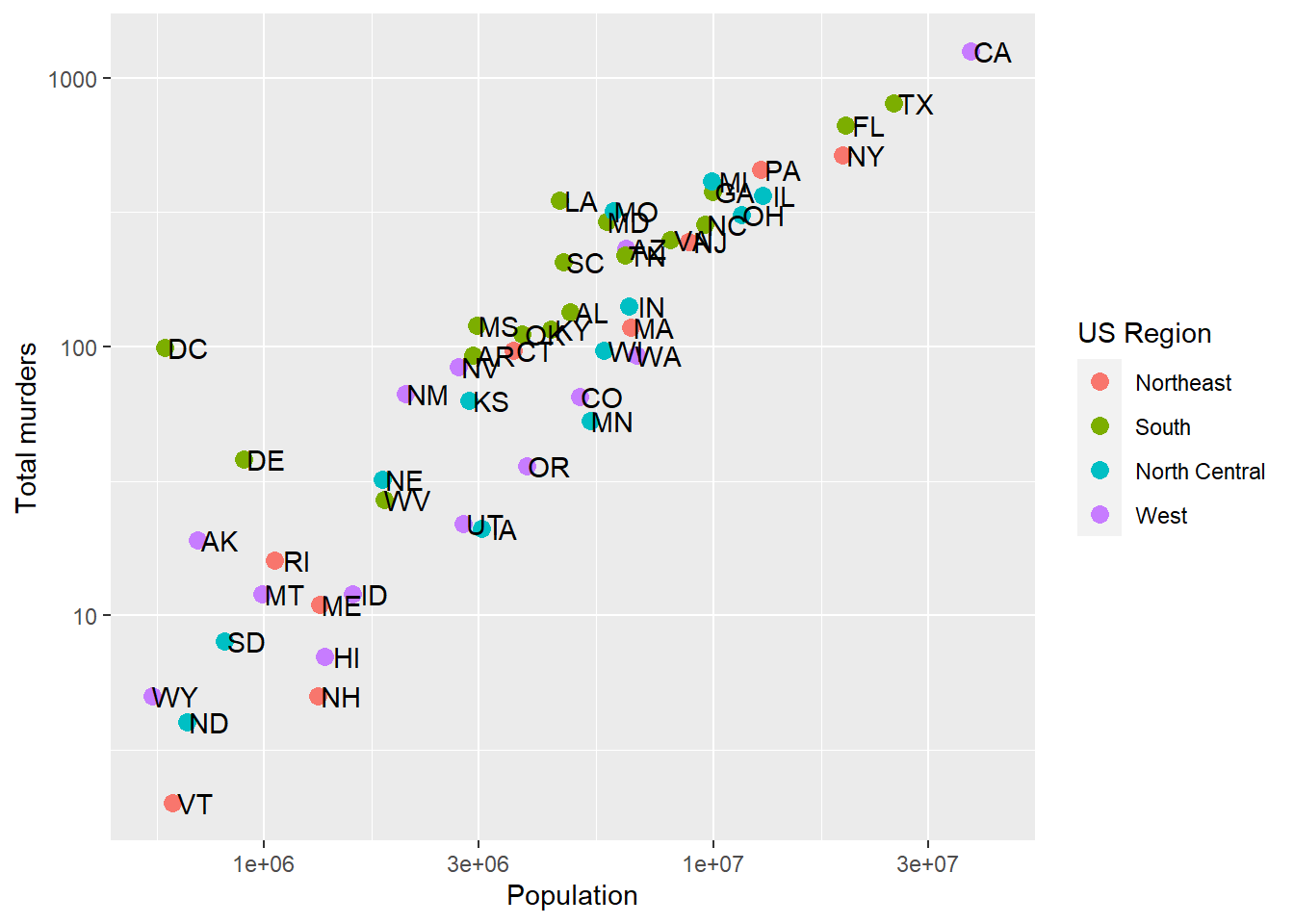
Well there we go! We can now see each stock price over time, with a convenient legend. If we don’t necessarily want a different color but we do want to separate the lines, we can use the group aesthetic.
ggplot(AAPLNFLX, aes(x = date, y = close, group = symbol)) +
  geom_line() +
  labs(x = 'Date', y = 'Closing price', title = 'Apple and Netflix stock price')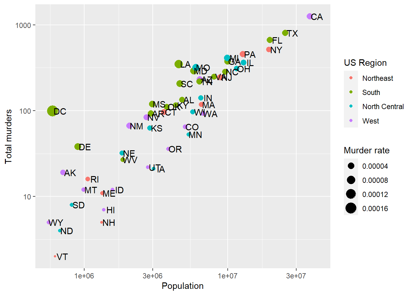
Similar result as mapping color, but without the color difference (which makes it rather hard to tell what you’re looking at). But if we add labels using geom_label, we’ll get one label for every point, which will be overwhelming. The solution? Use some filtered data so that there is only one point for each label. But that means replacing the data in ggplot. Here’s how.
Using different data with different geometries
Just as we can use different aesthetic mappings on each geometry, we can use different data entirely. This is useful when we want one geometry to have one set of data (like the stock prices above), but another geometry to only have a subset of the data. Why would we want that? Well, we’d like to label just one part of each of the lines in our plot, right? That means we want to label a subset of the stock data.
To replace data in a geometry, we just need to specify the data = argument separately:
ggplot(AAPLNFLX, aes(x = date, y = close, group = symbol)) +
  geom_line() +
  geom_label(data = AAPLNFLX %>% group_by(symbol) %>% slice(100),
             aes(label = symbol),
             nudge_y = 20) +
  labs(x = 'Date', y = 'Closing price', title = 'Apple and Netflix stock price')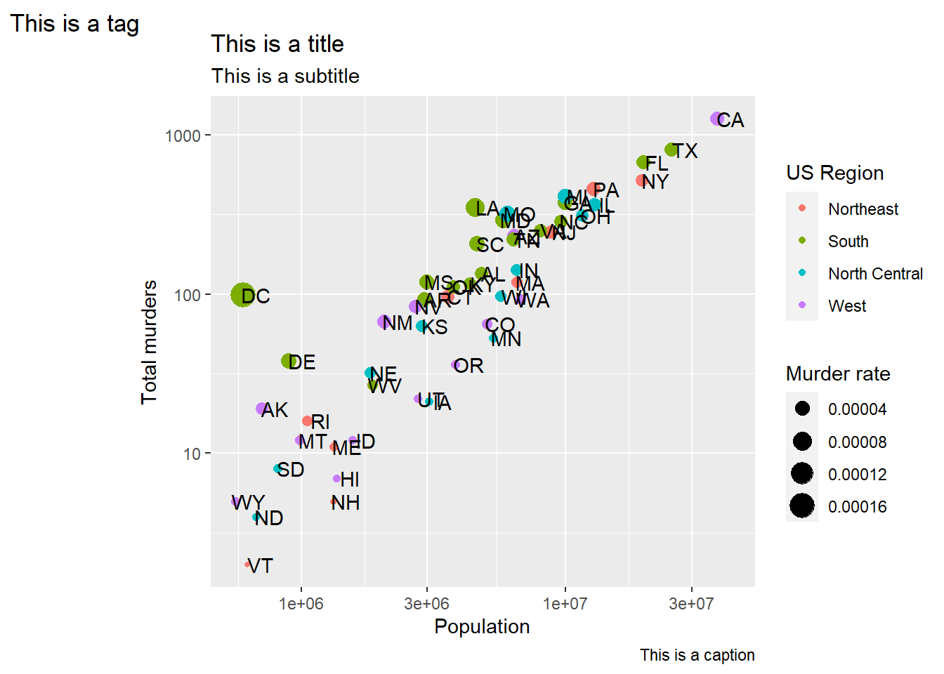
In geom_label, we specified we wanted the 100th observation from each symbol to be the label location. Then, we nudged it up along y by 20 so that it’s clear of the line.
R also has a very useful ggrepel package that gives us geom_label_repel which takes care of the nudging for us, even in complicated situations (lots of points, lines, etc.). It does a decent job here of moving the label to a point where it doesn’t cover a lot of data.
library(ggrepel)
ggplot(AAPLNFLX, aes(x = date, y = close, group = symbol)) +
  geom_line() +
  geom_label_repel(data = AAPLNFLX %>% group_by(symbol) %>% slice(100),
             aes(label = symbol)) +
  labs(x = 'Date', y = 'Closing price', title = 'Apple and Netflix stock price')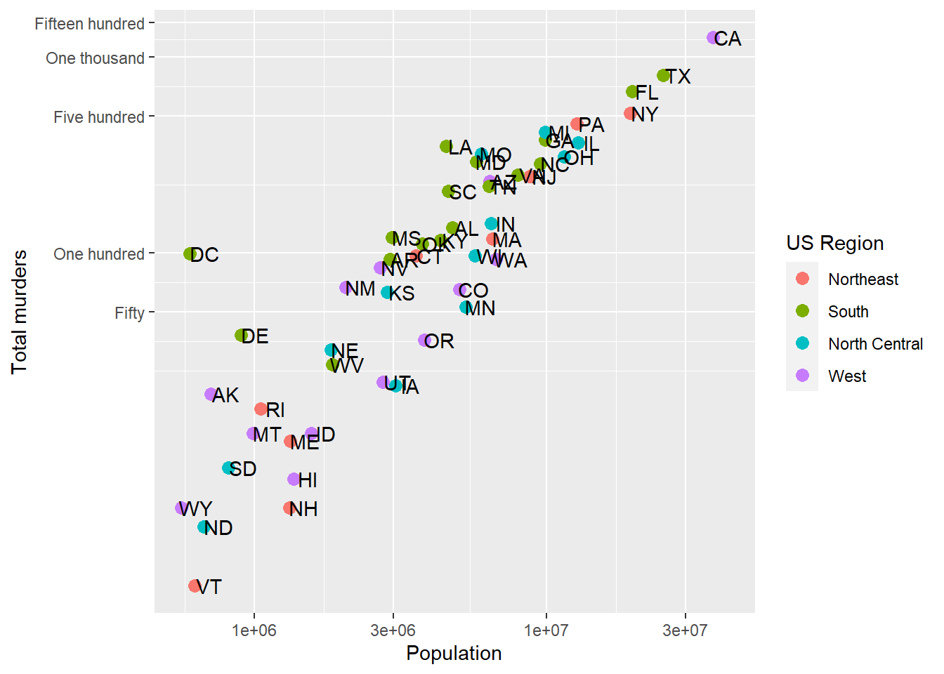
Now, we don’t lose a lot of space to a legend, and we haven’t had to use color to separate the stock symbols.
Try it: label each line on its last day instead of its 100th.
Back to the murders data
Load up our murders data
library(dslabs)
library(ggplot2)
library(dplyr)
data(murders)

p <- ggplot(data = murders, aes(x = population, y = total, label = abb))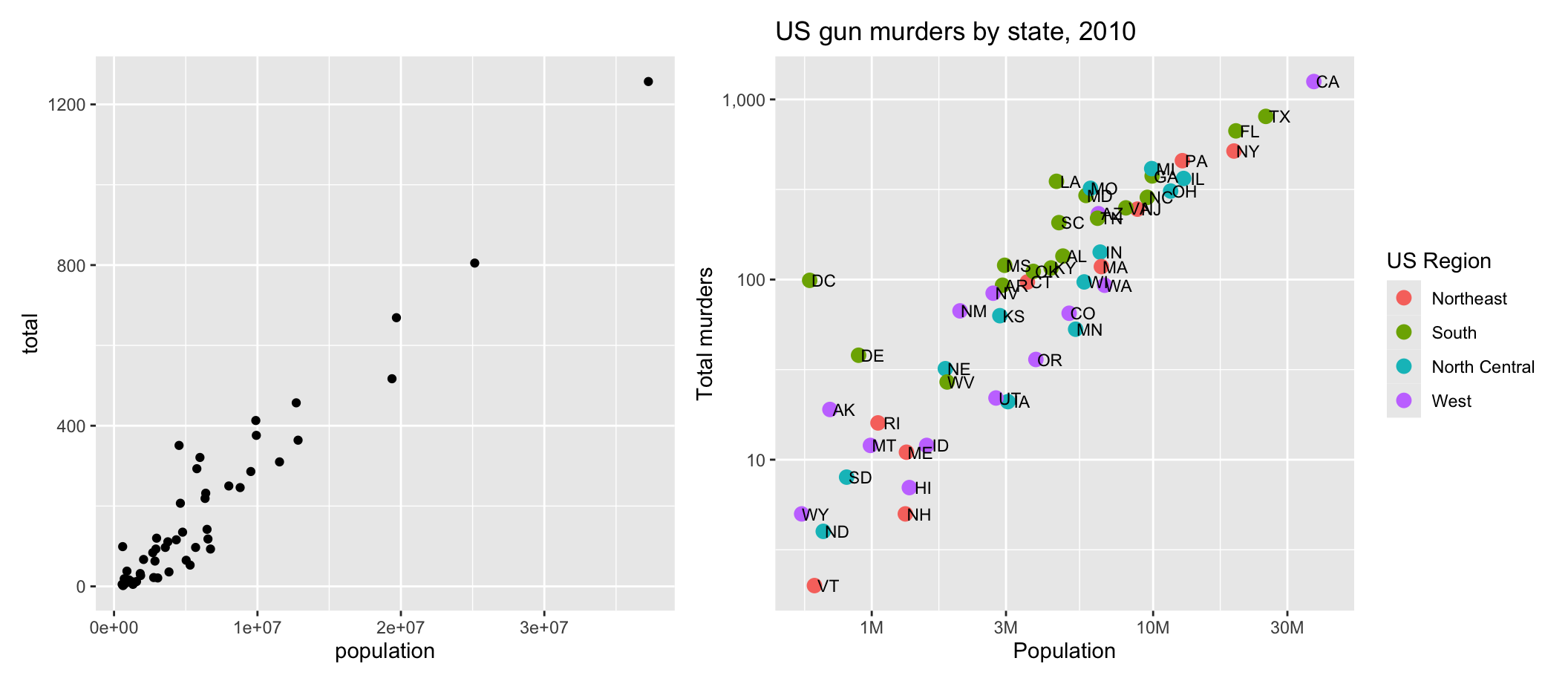
The left panel is p + geom_point(). The right panel is the same p. The rest of this page is how you get from one to the other.
Scales and transformations
Log transformations
In our first visualization lecture, we re-scaled our population by 10^6 (millions), but still had a lot of variation because some states are tiny and some are huge. Sometimes, we want to have one (or both) of our axes scaled non-linearly. For instance, if we wanted to have our x-axis be in log base 10, then each factor of 10 would take up the same distance on the axis. This is not the default, so this change needs to be added through a scales layer. A quick look at the cheat sheet reveals the scale_x_continuous function lets us control the behavior of scales. We use them like this:
p + geom_point(size = 3) +
  geom_text(nudge_x = 0.05) +
  scale_x_continuous(trans = "log10") +
  scale_y_continuous(trans = "log10")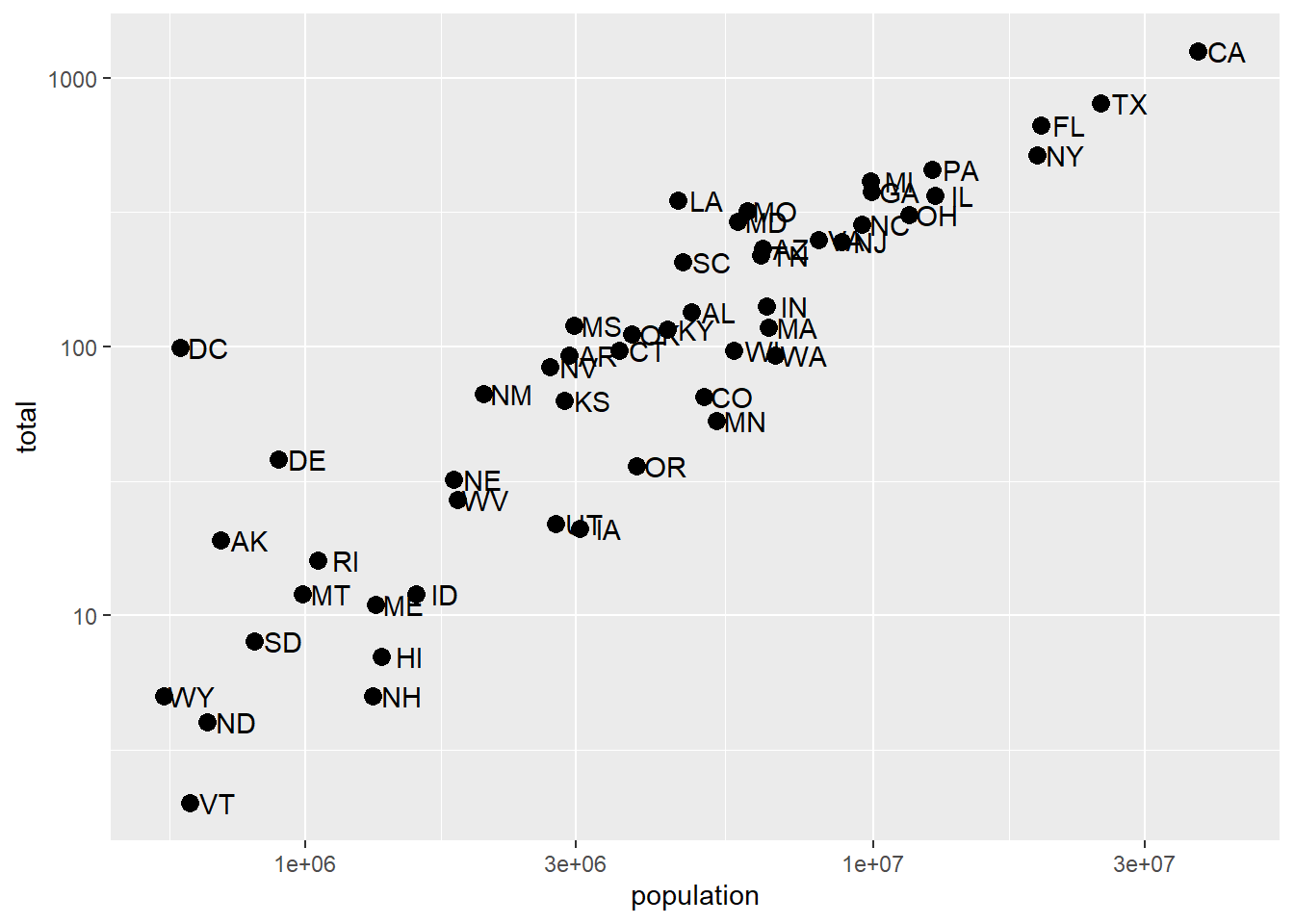
A couple of things here: adding things like scale_x_continuous(...) operates on the whole plot. In some cases, order matters, but it doesn’t here, so we can throw scale_x_continuous anywhere. Because we have altered the whole plot’s scale to be in the log-scale now, the nudge must be made smaller. It is in log-base-10 units. Using ?scale_x_continuous brings us to the help for both scale_x_continuous and scale_y_continuous, which shows us the options for transformations transform = ... (you’ll see trans = ... in older code, including the chunk above – it still works, but it’s deprecated)
This particular transformation is so common that ggplot2 provides the specialized functions scale_x_log10 and scale_y_log10 which “inherit” (take the place of) the scale_x_continuous functions but have log base 10 as default. We can use these to rewrite the code like this:
p + geom_point(size = 3) +
  geom_text(nudge_x = 0.05) +
  scale_x_log10() +
  scale_y_log10()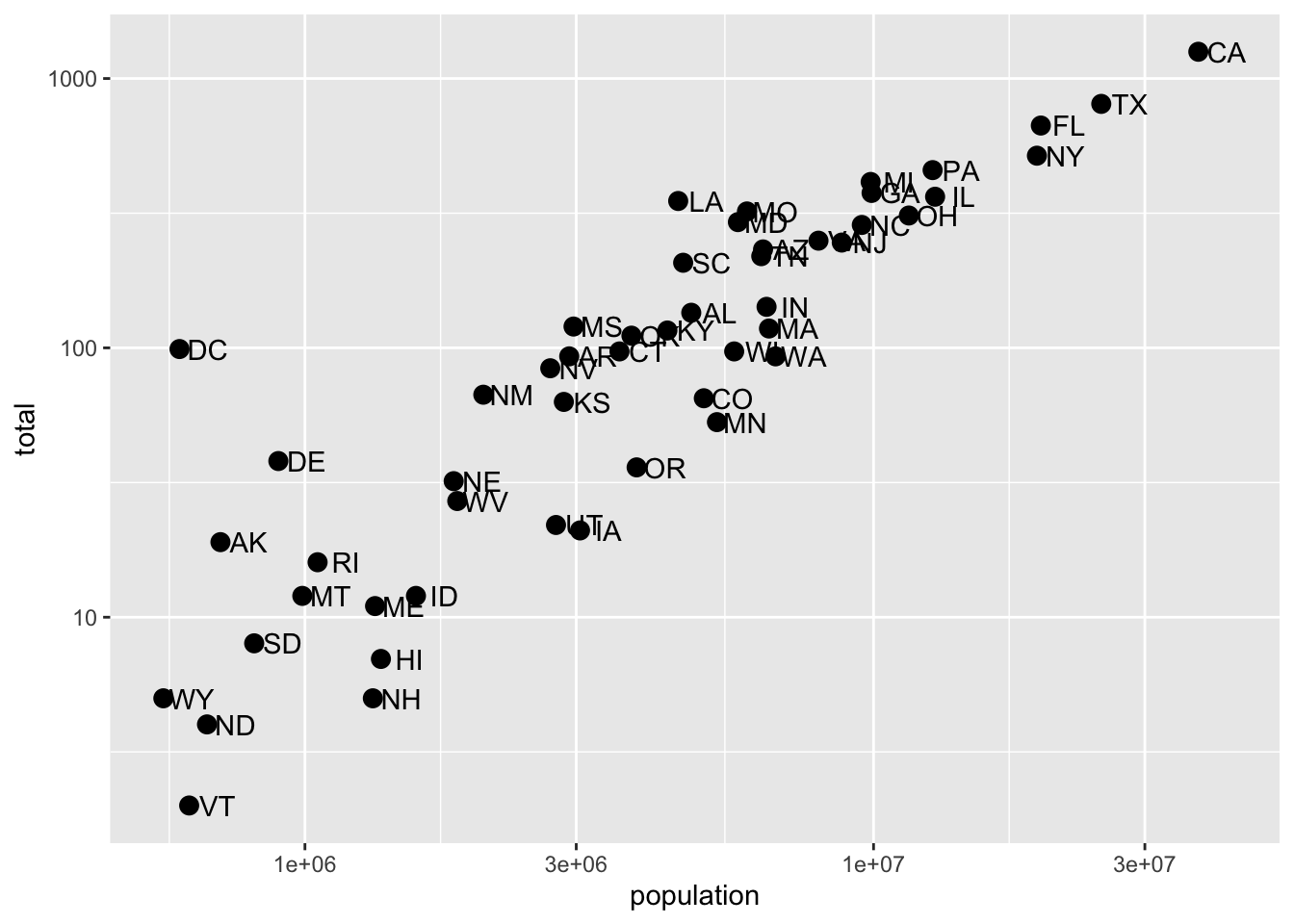
This can make a plot much easier to read, though one has to be sure to pay attention to the values on the axes. Plotting anything with very large outliers will almost always be better if done in log-scale. Adding the scale layer is an easy way to fix this.
We can also use one of many built-in transformations. Of note: reverse just inverts the scale, which can be helpful, log uses the natural log, sqrt takes the square root (dropping anything with a negative value), reciprocal takes 1/x. If your x-axis is in a date format, you can also scale to date; hms (hour-minute-second) is for times of day and durations.
Transforming data vs. transforming using scale_...
We could simply take the log of population and log of total in the call and we’d get something very similar. Note that we had to override the aesthetic mapping set in p in each of the geometries:
p + geom_point(aes(x = log(population, base=10), y = log(total, base=10)), size = 3) +
geom_text(aes(x = log(population, base=10), y = log(total, base=10)), nudge_x = 0.05) 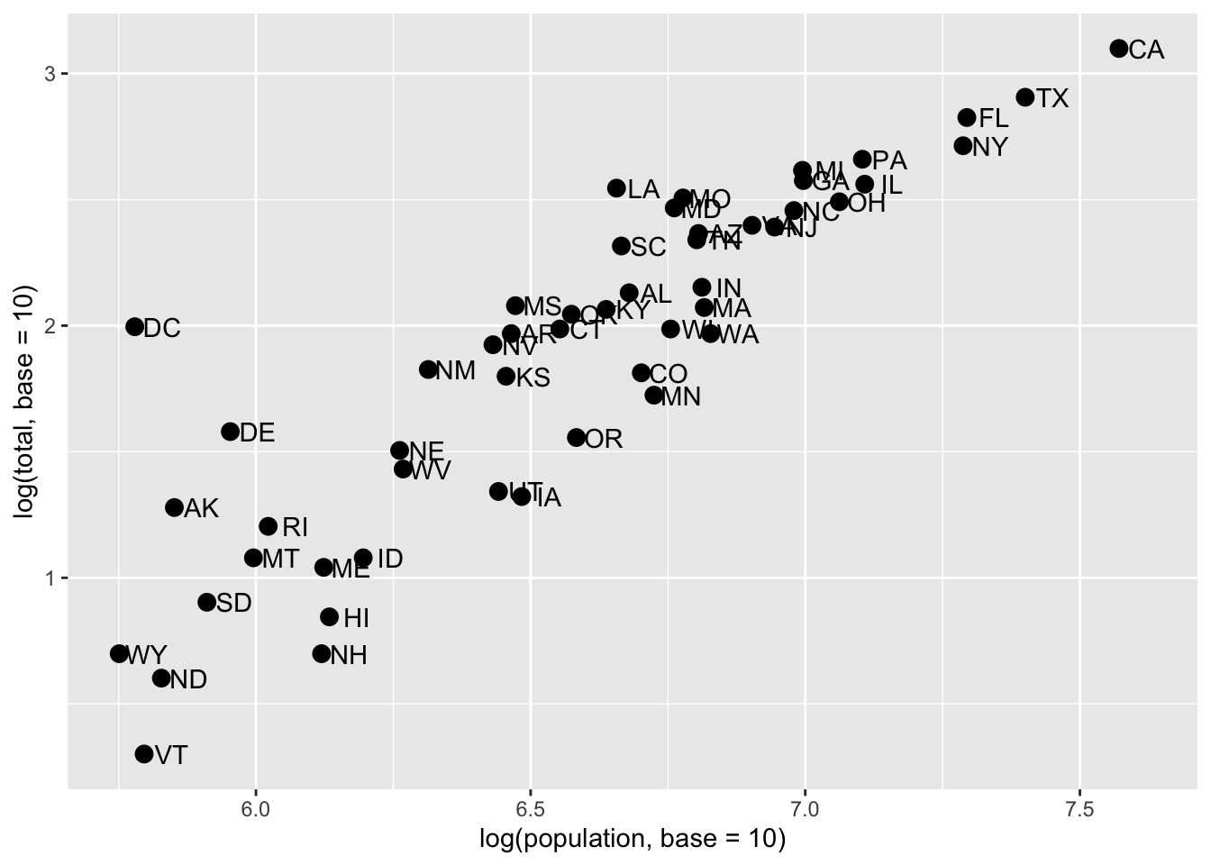
This avoids using scale_x_continuous or its child function scale_x_log10. One advantage to using scale_x... is that the axes are correctly labeled. When we transform the data directly, the axis labels only show the transformed values, so 10,000,000 becomes 7.0. This could be confusing! We could update the axis labels to say “total murders (log base 10)” and “total population (log base 10)”, but that’s cumbersome. Using scale_x... is a lot more refined and easy.
Axis labels, legends, and titles
But let’s say we did want to re-name our x-axis label. Or maybe we don’t like that the variable column name is lower-case “p”.
As with many things in ggplot, there are many ways to get the same result. We’ll go over one way of changing titles and labels, but know that there are many more.
Changing axis titles
We’ll use the labs(...) annotation layer to do this, which is pretty straightforward. ?labs shows us what we can change, and while it looks pretty basic, the real meat is in the ... argument, which the help says is “A list of new name-value pairs”. This means we can re-define the label on anything that is an aesthetic mapping. X and Y are aesthetic mappings, so…
p + geom_point(size = 3) +
  geom_text(nudge_x = 0.05) +
  scale_x_log10() +
  scale_y_log10() +
  labs(x = 'Population', y = 'Total murders')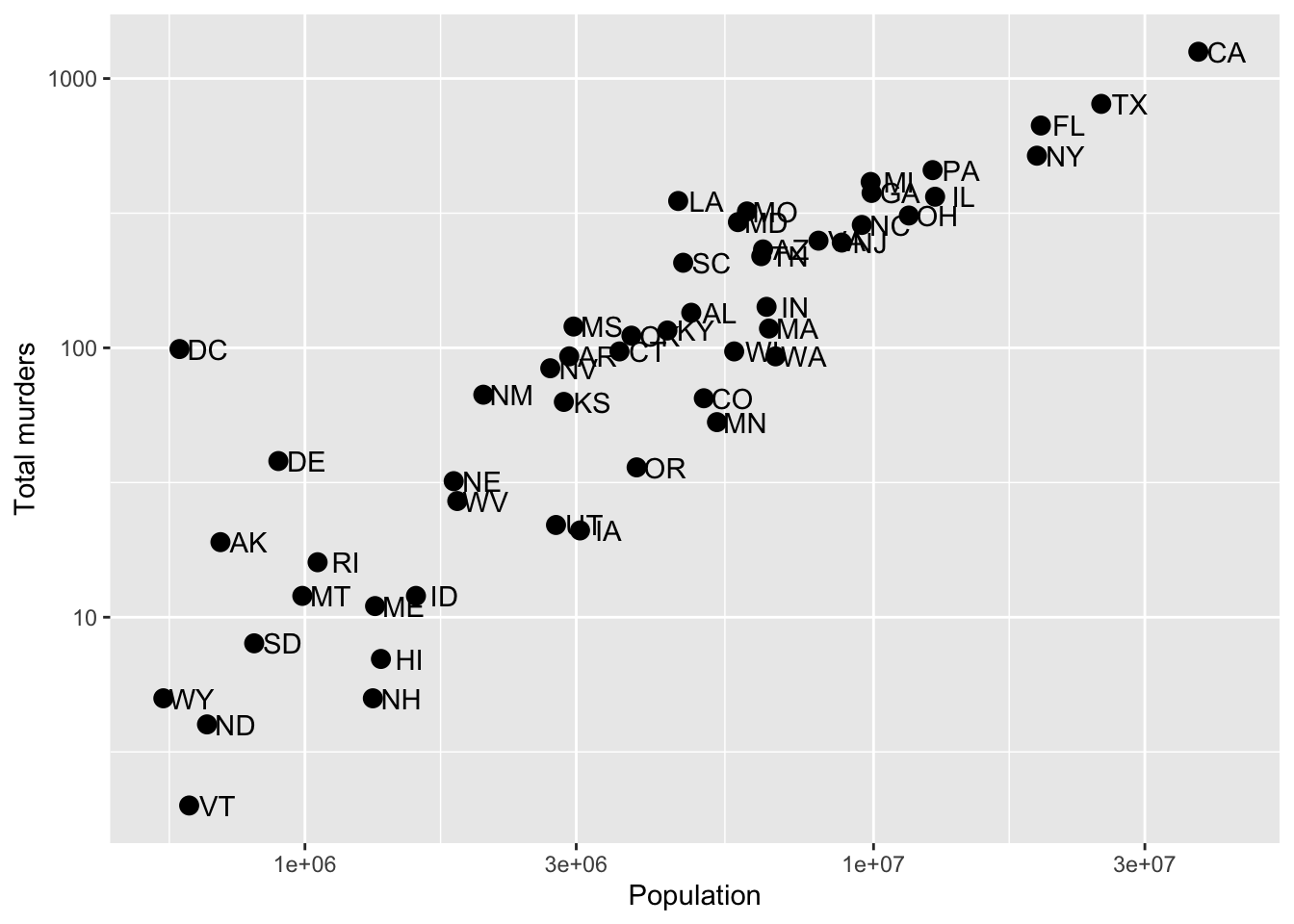
Now, let’s use an aesthetic mapping that generates a legend, like color, and see what labs renames:
p + geom_point(aes(color = region), size = 3) +
  geom_text(nudge_x = 0.05) +
  scale_x_log10() +
  scale_y_log10() +
  labs(x = 'Population', y = 'Total murders', color = 'US Region')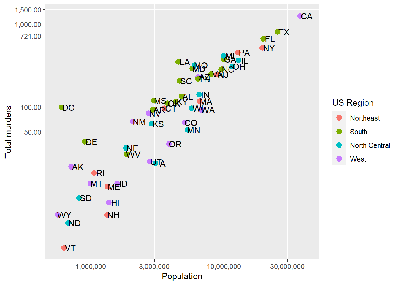
We can rename the aesthetic mapping-relevant label using labs. Even if there are multiple mapped aesthetics:
p + geom_point(aes(color = region, size = total/population)) +
  geom_text(nudge_x = 0.05) +
  scale_x_log10() +
  scale_y_log10() +
  labs(x = 'Population', y = 'Total murders', color = 'US Region', size = 'Murder rate')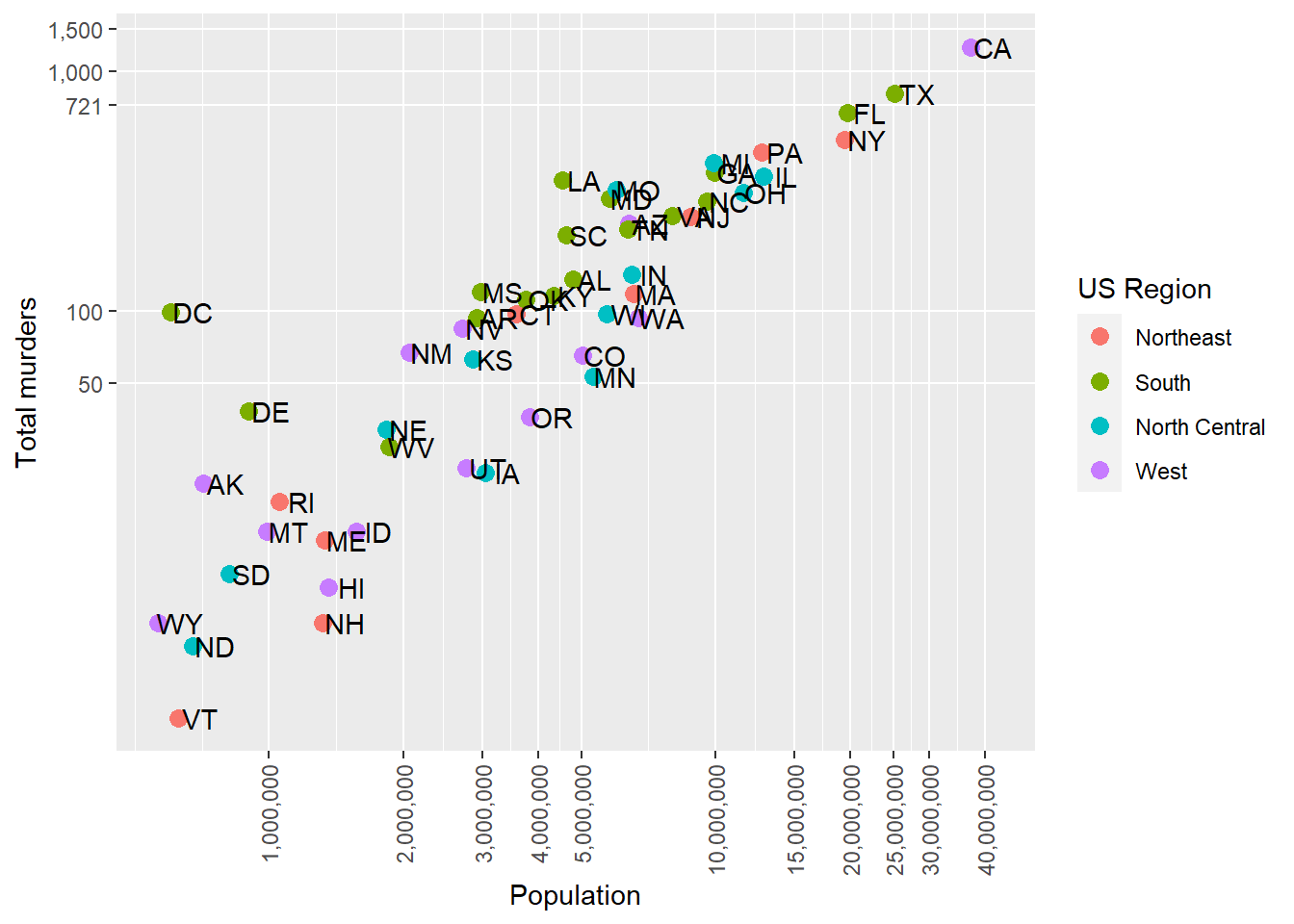
Plot Titles
In ?labs, we also see some things that look like titles and captions. We can include those:
p + geom_point(aes(color = region, size = total/population)) +
  geom_text(nudge_x = 0.05) +
  scale_x_log10() +
  scale_y_log10() +
  labs(x = 'Population', y = 'Total murders', color = 'US Region', size = 'Murder rate',
       title = 'This is a title', subtitle = 'This is a subtitle', caption = 'This is a caption', tag = 'This is a tag')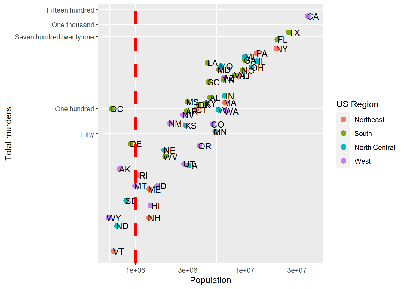
Now that you know how, always label your plots with at least a title and have meaningful axis and legend labels.
Axis ticks
In addition to the axis labels, we may want to format or change the axis tick labels (like “1e+06” above) or even where the tick marks and lines are drawn. If we don’t specify anything, the axis labels and tick marks are drawn as best as ggplot can do, but we can change this. This might be especially useful if our data has some meaningful cutoffs that aren’t found by the default, or we just don’t like where the marks fall or how they are labeled. This is easy to fix with ggplot.
To change the tick mark labels, we have to set the tick mark locations. Then we can set a label for each tick mark. Let’s go back to our murders data and take control of the Y-axis tick marks. We’ll use scale_y_continuous to tell R where to put the breaks (breaks =) and what to label the breaks. We have to give it one label for every break. Let’s say we just want a line at the 500’s and let’s say we want to (absurdly) use written numerics for each of the Y-axis lines. Since scale_y_log10 inherits from scale_y_continuous, we can just use that and add the breaks and labels:
p + geom_point(aes(color = region), size = 3) +
  geom_text(nudge_x = .05) +
  scale_x_log10() +
  scale_y_log10(breaks = c(50, 100, 500,1000,1500),
                     labels = c('Fifty','One hundred','Five hundred','One thousand','Fifteen hundred')) +
  labs(x = 'Population', y = 'Total murders', color = 'US Region')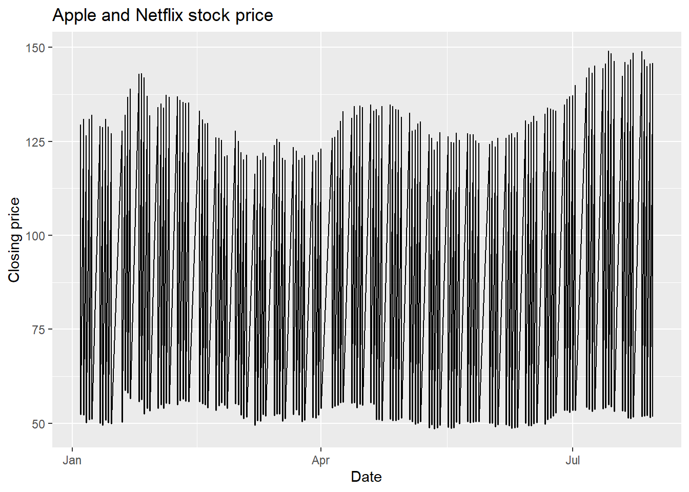
We have manually set both the location and the label for the y-axis. Note that R filled in the in-between “minor” tick lines, but we can take those out. Since we are setting the location of the lines, we can do anything we want:
p + geom_point(aes(color = region), size = 3) +
  geom_text(nudge_x = .05) +
  scale_x_log10() +
  scale_y_log10(breaks = c(50, 100, 721, 1000,1500),
                     labels = c('Fifty','One hundred','Seven hundred twenty one','One thousand','Fifteen hundred'),
                     minor_breaks = NULL) +
  labs(x = 'Population', y = 'Total murders', color = 'US Region')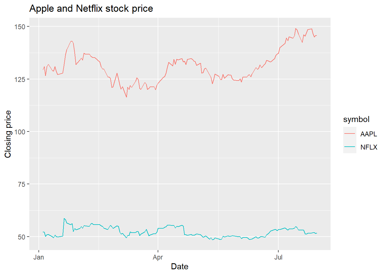
So we can now define where axis tick lines should lie and how they should be labeled.
Flexible axis tick labels
Anyone else annoyed by the scientific 1e+06-style x-axis labels? If you’re not familiar, 1e+06 means 1 * 10^6 or 1,000,000. Of course, we could manually make the labels (and the breaks) like we did above, but that might be tedious, and what if we have different ranges of data? We’d end up forcing tick marks in areas that are far out of the support of the data (off the plot).
We can also use a labeler function. The most common ones are in the scales package, so you’ll want to install that and load it up using library(scales). Each labeler is a function that takes as its first argument a vector of numbers (or some expected format, like dates) and returns a formatted character vector of labels.
So the following will happen:
scales::label_comma
numbers.vector = c(20000, 50000, 100000, 500000, 1000000) # 20k to 1M

scales::label_comma(numbers.vector, big.mark = ',', decimal.mark = '.')
function (x)
{
number(x, accuracy = accuracy, scale = scale, prefix = prefix,
suffix = suffix, big.mark = big.mark, decimal.mark = decimal.mark,
style_positive = style_positive, style_negative = style_negative,
scale_cut = scale_cut, trim = trim, ...)
}
<bytecode: 0x9f6a99c08>
<environment: 0x9f8a07ab8>Wha? That looks like the output…is a function?
Yes. Yes it is. The function returns….a function. And that function takes the number and returns the labels:
scalefun = scales::label_comma(big.mark = ',', decimal.mark = '.')

scalefun(numbers.vector)
[1] "20,000" "50,000" "100,000" "500,000" "1,000,000"Now we have the appropriate format! Here are some others:
scalefun.percent = scales::label_percent(accuracy = .001, scale=100)

scalefun.percent(murders$total[1:5]/murders$population[1:5])
[1] "0.003%" "0.003%" "0.004%" "0.003%" "0.003%"scalefun.dollar = scales::label_dollar(accuracy = 1, scale=1)
scalefun.dollar(numbers.vector)[1] "$20,000" "$50,000" "$100,000" "$500,000" "$1,000,000"Note that we could set the accuracy and scale arguments in scales::label_percent and scales::label_dollar. The accuracy argument determines rounding. We don’t need cents when we have dollar values up to 1M, but we do need fractions of a percent when we use the murder rate (not multiplied by 100,000).
Using labeler functions
The above was just an illustration of how the labelers work. To use it in practice, we need only give the labeler to ggplot – note the parentheses, since label_comma() is what hands back the function:
p + geom_point(aes(color = region), size = 3) +
  geom_text(nudge_x = .05) +
  scale_x_log10(labels= scales::label_comma()) +
  scale_y_log10(breaks = c(50, 100, 721, 1000,1500),
                     labels = scales::label_comma(accuracy=.01),
                     minor_breaks = NULL) +
  labs(x = 'Population', y = 'Total murders', color = 'US Region')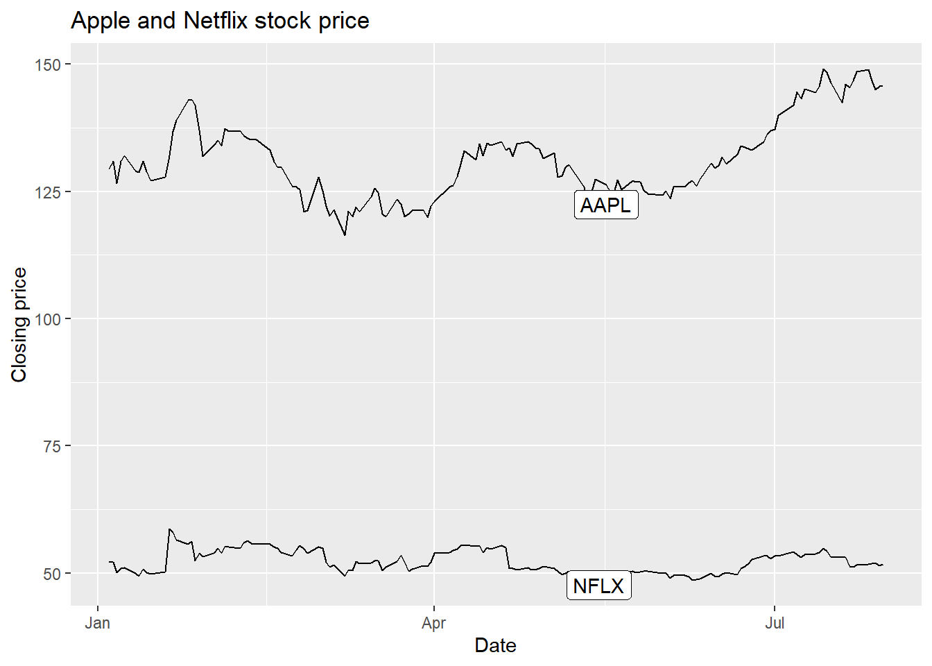
We don’t need the decimals on the y-axis tick labels, it’s just there for illustration.
Try it: put the murder rate, total/population, on the y-axis with label_percent.
Sometimes, our axis tick labels are still too long. When numbers get long, we usually have standard ways of representing them (like K, M, B, and T for thousand, million, billion, and trillion). Labeler functions can make this easy for us.
We can use the labels = label_comma(scale_cut = cut_short_scale()) argument to shorten the display and use the common suffix.
p + geom_point(aes(color = region), size = 3) +
  geom_text(nudge_x = .05) +
  scale_x_log10(labels= scales::label_comma(scale_cut = scales::cut_short_scale())) +
  scale_y_log10(labels= scales::label_comma(scale_cut = scales::cut_short_scale())) +
  labs(x = 'Population', y = 'Total murders', color = 'US Region')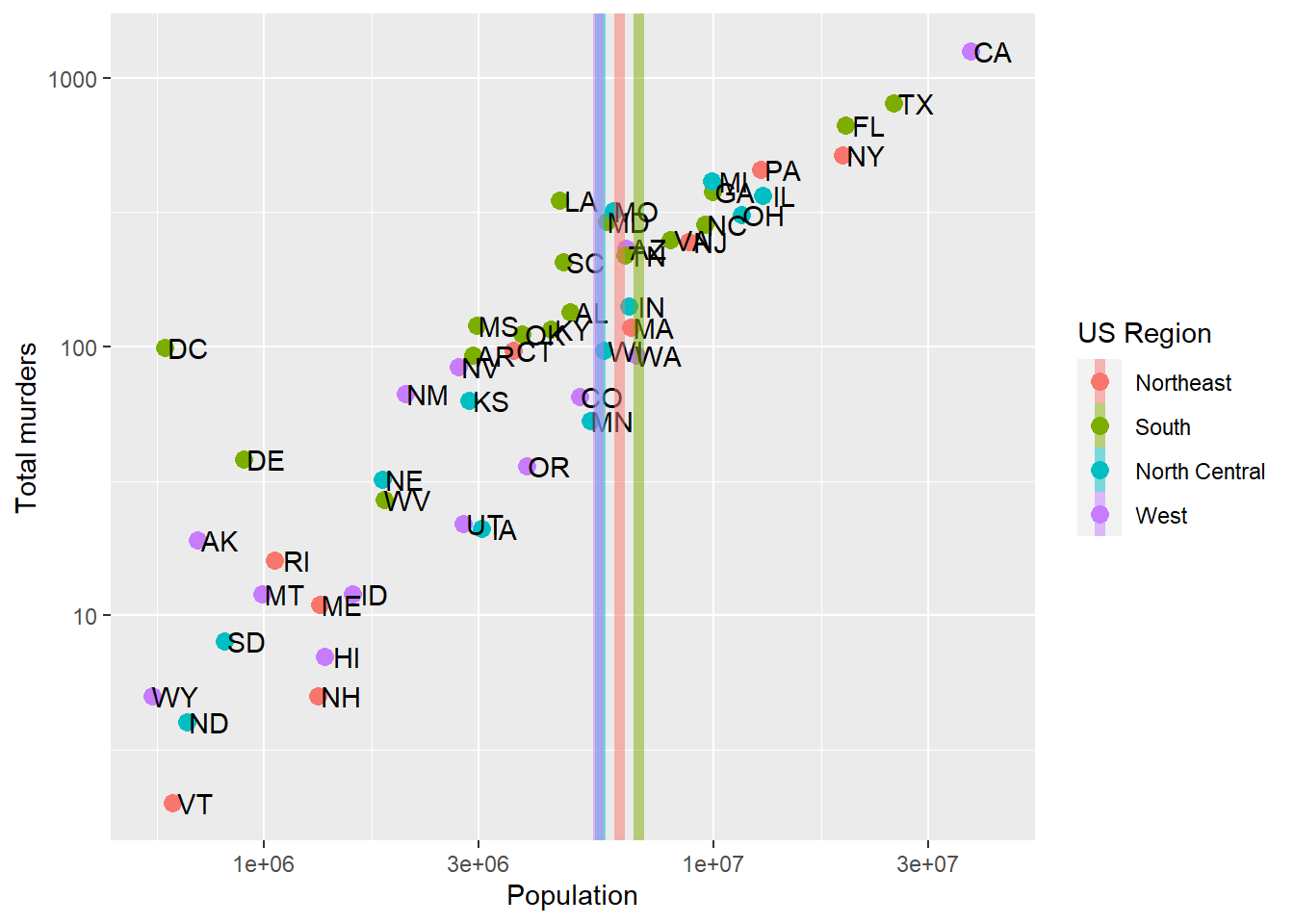
Of course, we could also transform the Population and total variables, dividing by 1,000,000 or 1,000, then add “Thousands” or “Millions” to the label. But this way is cleaner. Also, notice on the Y-axis that the suffix “K” is only used when necessary – we don’t have “.01K” on there.
There is also a cut_si() function that takes as an input a scientific unit (like “g” for grams). It’ll use SI prefixes, so cut_si("g") would have “g”, then “kg”, then “Mg” where needed on the axis.
There are lots of other neat tricks for axis labels on the tidyverse scales vignette
Axis tick label orientation
While the default log-scale breaks leave some room on the x-axis, we can also alter the orientation of the labels. This occurs in the theme() call since it adjusts the layout or styling of the plot. Here, I’ve put in a bunch of breaks at 1 million to 40 million, and then asked ggplot to rotate and adjust the x-axis tick labels. hjust and vjust move the horizontal and vertical justification of the label – where the text sits relative to its tick mark. angle changes the orientation. Careful, though: justification follows the rotated text, so at angle = 90 it’s hjust that slides the label up and down and vjust that centers it on its tick.
p + geom_point(aes(color = region), size = 3) +
  geom_text(nudge_x = .05) +
  scale_x_log10(breaks = c(1,2,3,4,5,10,15,20,25,30, 40)*1000000, labels= scales::label_comma()) +
  scale_y_log10(breaks = c(50, 100, 721, 1000,1500),
                     labels = scales::label_comma(accuracy=1),
                     minor_breaks = NULL) +
  labs(x = 'Population', y = 'Total murders', color = 'US Region') +
  theme(axis.text.x = element_text(angle = 90, hjust = 1, vjust = 0.5))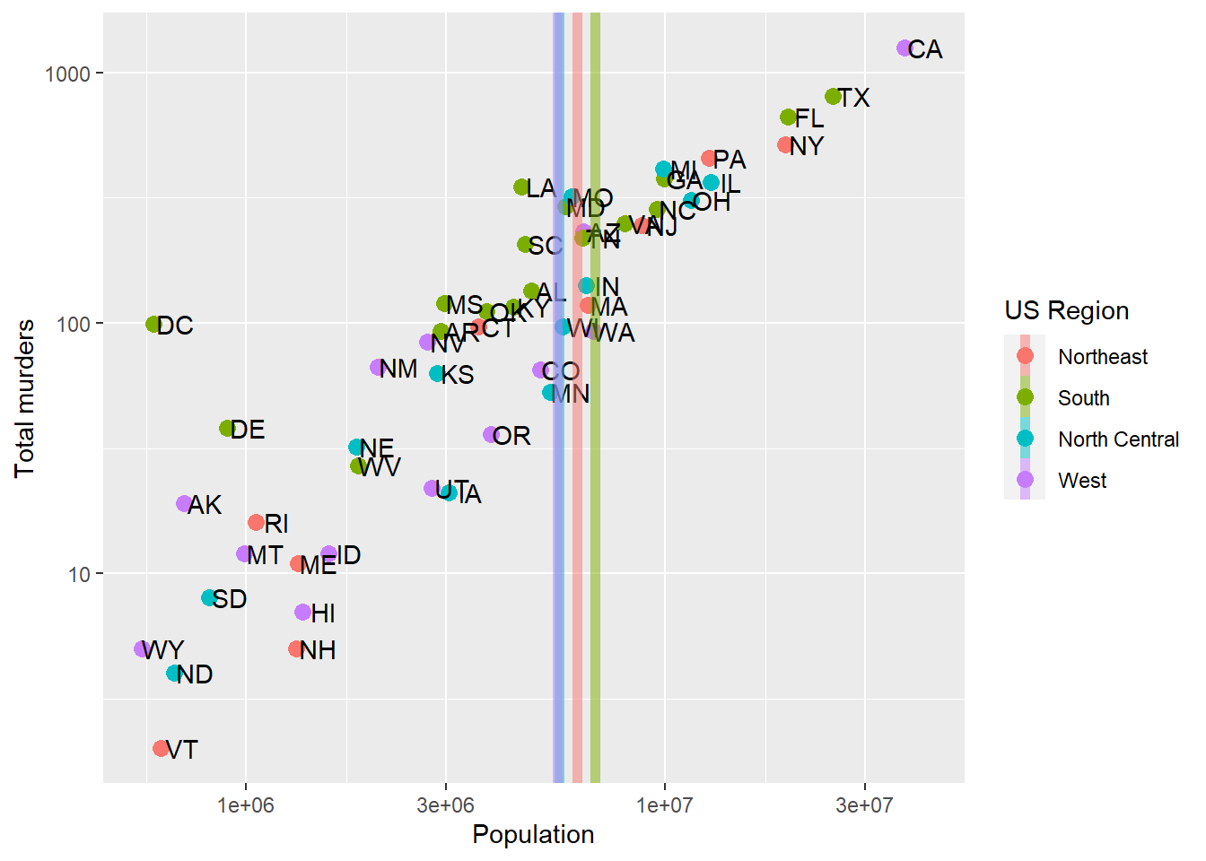
Note that rotating the axis text unfortunately doesn’t add more breaks by default (leaving breaks = ... empty wouldn’t add more breaks to the x axis). Also, ?element_text will let you see the other things you can change (color, font family)
Additional geometries
Let’s say we are happy with our axis tick locations, but we want to add a single additional line. Maybe we want to divide at 1,000,000 population (a vertical line at 1,000,000) because we think those over 1,000,000 are somehow different, and we want to call attention to the data around that point. As a more general example, if we were to plot, say, car accidents by age, we would maybe want to label age 21, when people can legally purchase alcohol (and subsequently cause car accidents).
geom_vline lets us add a single vertical line (without aesthetic mappings). If we look at ?geom_vline we see that it requires one aesthetic: xintercept. It also takes aesthetics like color and linewidth, and introduces the linetype aesthetic:
p + geom_point(aes(color = region), size = 3) +
  geom_text(nudge_x = .05) +
  geom_vline(xintercept = 1000000, col = 'red', linewidth = 2, linetype = 2) +
  scale_x_log10() +
  scale_y_log10(breaks = c(50, 100, 721, 1000,1500),
                     labels = c('Fifty','One hundred','Seven hundred twenty one','One thousand','Fifteen hundred'),
                     minor_breaks = NULL) +
  labs(x = 'Population', y = 'Total murders', color = 'US Region')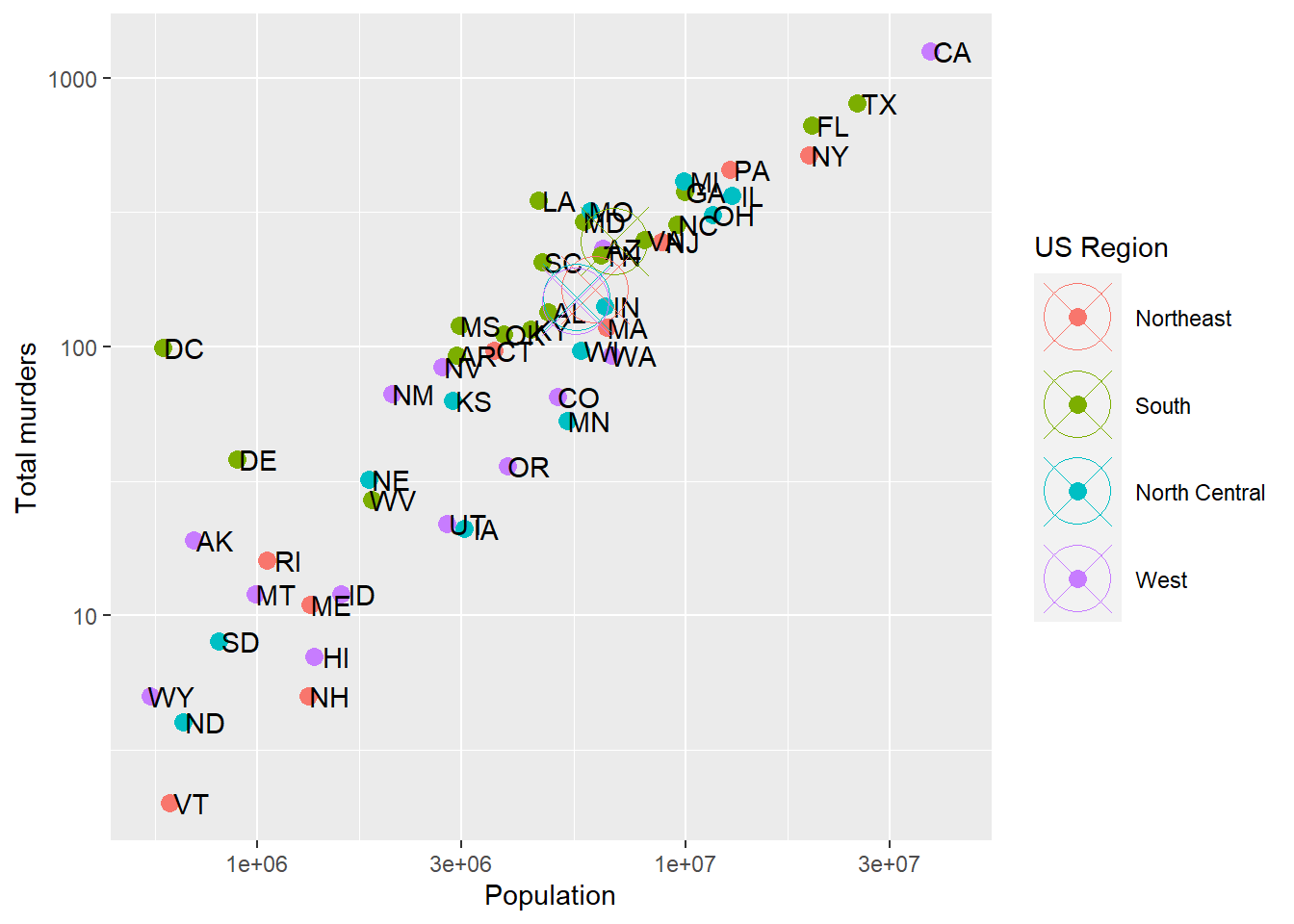
Combining geometries is as easy as adding the layers with +.
Try it: move the line to the median state population.
Summarizing data and including in ggplot
Often, we’ll want to have lines or highlights in places that are derived from the data. In the above example from murders, we added a line at an arbitrary x-value (population) of 1,000,000. Often, though, we’ll want to show some summary of the data on the plot. That also requires using a second dataset (derived from the first).
Let’s say we want to show the average state population for each region. We’ll need to use two different data objects, one for the original, one for the summary. Create the summary first:
murders.summary = murders %>%
  group_by(region) %>%
  dplyr::summarize(meanpop = mean(population),
                   meantot = mean(total),
                   meanrate = 100000*sum(total)/sum(population))

print(murders.summary)
# A tibble: 4 × 4
region meanpop meantot meanrate
<fct> <dbl> <dbl> <dbl>
1 Northeast 6146360 163. 2.66
2 South 6804378. 247. 3.63
3 North Central 5577250. 152. 2.73
4 West 5534273. 147 2.66Then, use both murders and murders.summary in the plot:
p + geom_point(aes(color = region), size = 3) +
  geom_text(nudge_x = .05) +
  geom_vline(data = murders.summary,
             aes(xintercept = meanpop, color=region), linewidth = 2, linetype = 1, alpha=.5) +
  scale_x_log10() +
  scale_y_log10() +
  labs(x = 'Population', y = 'Total murders', color = 'US Region')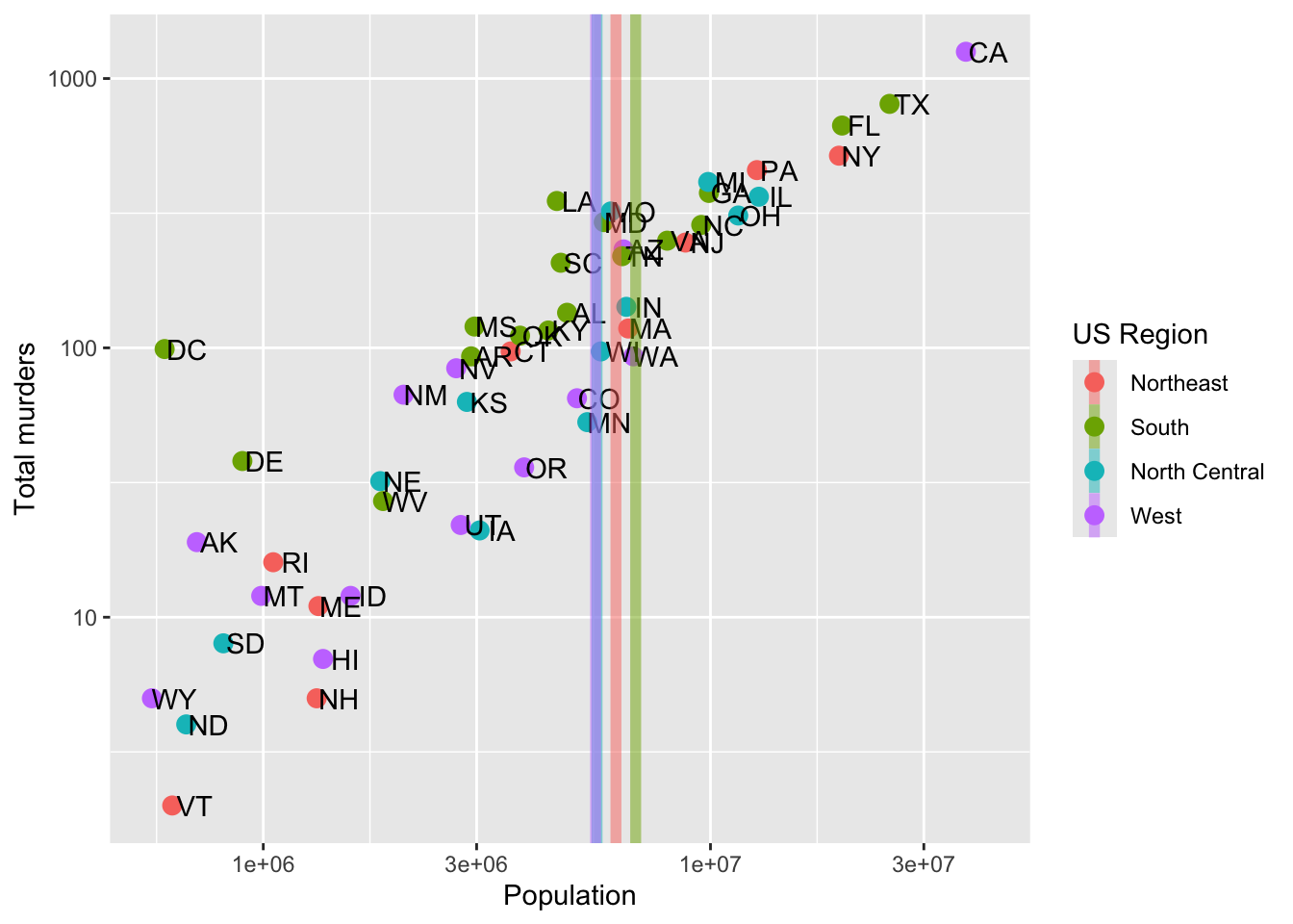
Note that we get the same color mapping – this is automatic, because every layer in a plot shares one color scale, so South gets the same color in both layers as long as it’s spelled the same way. What the factor levels control is which color each region gets (and the legend order): ggplot assigns colors in level order – not in the order the rows happen to show up. If we want to control that, we set the levels using factor and overwrite our old region column:
murders.summary = murders %>%
  group_by(region) %>%
  dplyr::summarize(meanpop = mean(population),
                   meantot = mean(total),
                   meanrate = 100000*sum(total)/sum(population)) %>%
  dplyr::mutate(region = factor(region, levels = levels(murders$region)))

print(murders.summary)
# A tibble: 4 × 4
region meanpop meantot meanrate
<fct> <dbl> <dbl> <dbl>
1 Northeast 6146360 163. 2.66
2 South 6804378. 247. 3.63
3 North Central 5577250. 152. 2.73
4 West 5534273. 147 2.66Perhaps we would like to summarize the regional average Population and Murders by adding representative points. Since we’re adding new data, we have to remove the label=abb part of the aes that inherits to each geom, which we do with label=NULL in the new point geometry:
p + geom_point(aes(color = region), size = 3) +
  geom_text(nudge_x = .05) +
  geom_point(data = murders.summary, aes(x = meanpop, y = meantot, color = region, label = NULL), size =12, shape=13) +
  scale_x_log10() +
  scale_y_log10() +
  labs(x = 'Population', y = 'Total murders', color = 'US Region')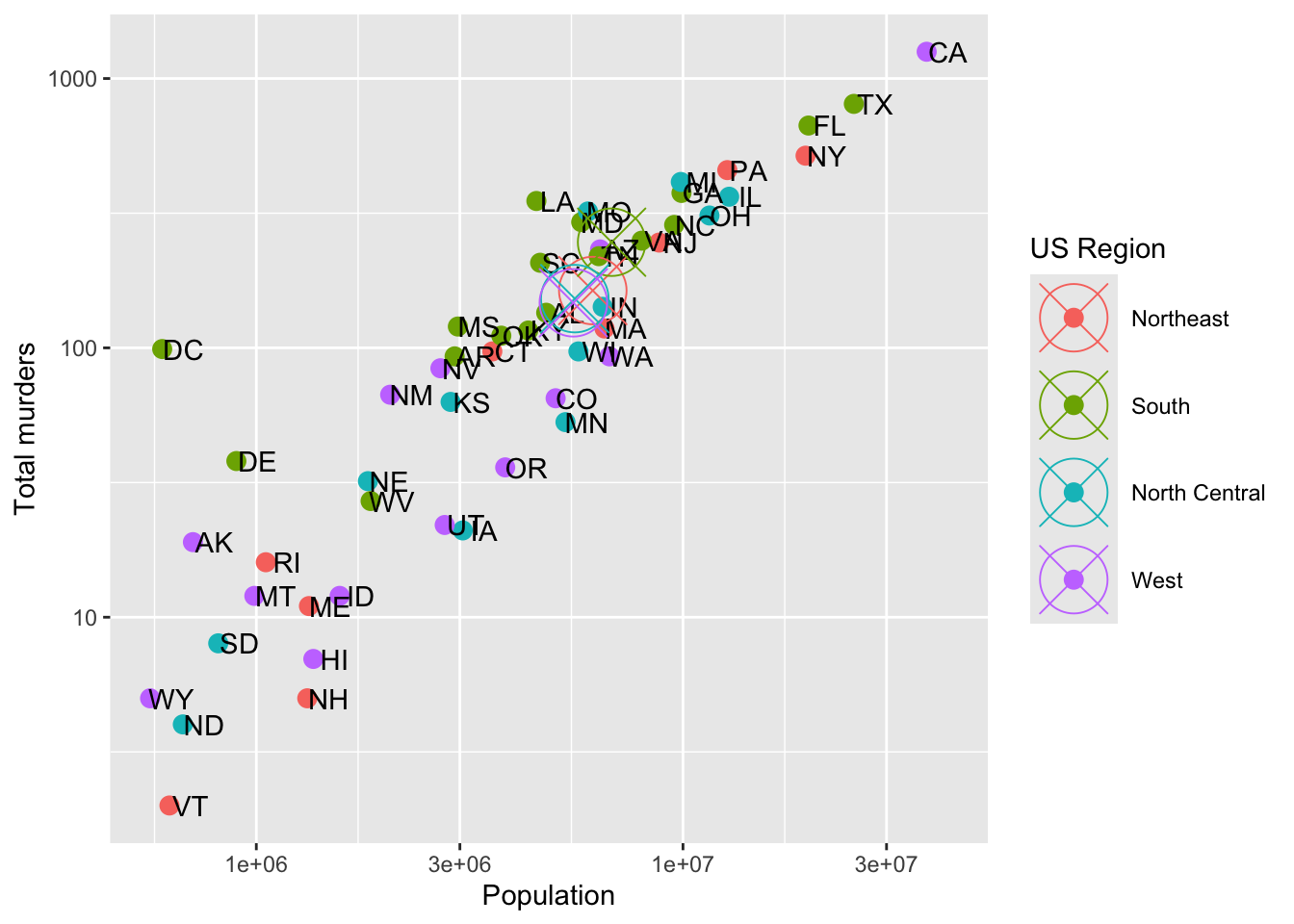
NoteTry it!
In-Class Activity: Comparing 2008 Electoral Votes and Polling Data.
In this activity, we will use R to visualize and compare the actual electoral votes from the 2008 presidential election with the polling data prior to the election. Specifically, we will explore how accurately the polls predicted the election results. Yes, I know this is an older election… that’s kind of the point. This isn’t a politics class.
Setup:
You’ll need to download two CSV files and put them somewhere on your computer (or upload it to RStudio.cloud if you’ve gone that direction)—preferably in a folder named data in your project folder. You can download the data from the link below:
Steps Prior to Analysis:
- Load the Data
# Load the necessary libraries
library(tidyverse)
electoral_votes <- read_csv("path_to/pres08.csv")
polling_data <- read_csv("path_to/polls08.csv") %>%
  dplyr::mutate(middate = as.Date(middate)) # we'll tackle dates later
Note that you’ll have to replace path_to with the actual path to the files on your computer.
- Data Preparation
We need to aggregate the polling data to get an average poll result for each state. We will then merge this with the electoral votes data.
# Aggregating polling data
avg_polls <- polling_data %>%
  group_by(state) %>%
  summarise(Obama_avg = mean(Obama), McCain_avg = mean(McCain))

# Merging with electoral votes data
combined_data <- merge(electoral_votes, avg_polls, by = "state")
Then, we need to generate a variable that represents the discrepancy between results (Obama and McCain) and the polling averages (Obama_avg and McCain_avg). Use mutate() to do so.
Finally, we want something to cut the data – below, we have some definitions for region. Use those (perhaps with case_when()?) to load in the state-to-region mapping.
# Define the regions
Northeast = c('CT', 'ME', 'MA', 'NH', 'RI', 'VT', 'NJ', 'NY', 'PA')
Midwest =  c('IL', 'IN', 'MI', 'OH', 'WI', 'IA', 'KS', 'MN', 'MO', 'NE', 'ND', 'SD')
South = c('DE', 'FL', 'GA', 'MD', 'NC', 'SC', 'VA', 'DC', 'WV', 'AL', 'KY', 'MS', 'TN', 'AR', 'LA', 'OK', 'TX')
West = c('AZ', 'CO', 'ID', 'MT', 'NV', 'NM', 'UT', 'WY', 'AK', 'CA', 'HI', 'OR', 'WA')- Complete Your Analysis
You are tasked with two different things:
A: The discrepancy between polls and results, using combined_data. In this order:
- One number per state. Plot the discrepancy for all 51 states, largest to smallest. How many polls went into each state’s average? Look at DC’s.
- By region. Add regions with the definitions above and
case_when(). Do the polls miss by more in some regions than others? - The polls and the results don’t add to 100. Compute
100 - Obama - McCainand100 - Obama_avg - McCain_avg. Were the polls wrong, or incomplete?
B: Visualize the relationship between the actual results and the poll results over time for the following states: c('MI','WI','IA','FL','NC','GA'). Does this relationship change over time? Or, put another way, were early polls or later polls more accurate? To do this, you’ll need to merge the final Obama and McCain results from electoral_votes into the original polling_data. Both contain state columns! (They also both contain Obama and McCain, so rename one set first or you’ll end up with Obama.x and Obama.y.)
Make sure you label your axes, legends, and other elements correctly. You may work in groups of up to three.
Use Zoom to share. Happy visualizing!
Footnotes
Pulled from Yahoo Finance with
tidyquant:tq_get(c("AAPL","NFLX"), from = '2021-01-01', to = '2021-08-01', get = 'stock.prices').install.packages('tidyquant')if you want to pull your own. Yahoo adjusts its history for later stock splits, so these are not the prices you would have seen in 2021.↩︎