3: Applying ggplot2 to Real Data
Due Date
This assignment is due on Monday, February 2nd
All assignments are due on D2L by 11:59pm on the due date. Late work is not accepted. You do not need to submit your .rmd file - just the properly-knitted PDF. All assignments must be properly rendered to PDF using Latex. Make sure you start your assignment sufficiently early such that you have time to address rendering issues. Come to office hours or use the course Slack if you have issues. Using an Rstudio instance on posit.cloud is always a feasible alternative. Remember, if you use any AI for coding, you must comment each line with your own interpretation of what that line of code does.
Preliminaries
As always, we will first have to load ggplot2. To do this, we will load the tidyverse by running this code:
library(tidyverse)Background
The New York City Department of Buildings (DOB) maintains a list of construction sites that have been categorized as “essential” during the city’s shelter-in-place pandemic order. They’ve provided an interactive map here where you can see the different projects. There’s also a link there to download the complete dataset.
For this exercise, you’re going to use this data to visualize the amounts or proportions of different types of essential projects in the five boroughs of New York City (Brooklyn, Manhattan, the Bronx, Queens, and Staten Island).
As you hopefully figured out by now, you’ll be doing all your R work in R Markdown. You can use an RStudio Project to keep your files well organized (either on your computer or on RStudio.cloud), but this is optional. If you decide to do so, either create a new project for this exercise only, or make a project for all your work in this class.
You’ll need to download one CSV file and put it somewhere on your computer (or upload it to RStudio.cloud if you’ve gone that direction)—preferably in a folder named data in your project folder. You can download the data from the DOB’s map, or use this link to get it directly:
R Markdown
Writing regular text with R Markdown follows the rules of Markdown. You can make lists; different-size headers, etc. This should be relatively straightfoward. We talked about a few Markdown features like bold and italics in class. See this resource for more formatting.
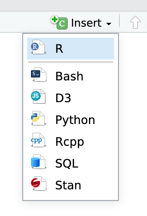
You’ll also need to insert your own code chunks where needed. Rather than typing them by hand (that’s tedious and you might miscount the number of backticks!), use the “Insert” button at the top of the editing window, or type ctrl + alt + i on Windows, or ⌘ + ⌥ + i on macOS.
Data Prep
Once you download the EssentialConstruction.csv file and save it in your project folder, you can open it and start cleaning. Loading in the basic data is straightforward:
library(tidyverse)
essential = read_csv('pathTo/EssentialConstruction.csv')
Where the “pathTo” part is the path to your local folder. If you saved the data in the same folder as your template, then you can just use:
essential = read_csv('EssentialConstruction.csv')Once loaded, note that each row is an approved project (the JOB NUMBERS are approved projects, so each row is one approved project).
Exercise 1 of 2: Essential pandemic construction
Uh-oh! One of our columns has different capitalization. Use case_when (or any other method) to make sure you have consistent character strings for each borough.
Then, assume that each row (observation) is an approved construction project.
A. Show the count or proportion of approved projects by borough using a bar chart. Make sure all the elements of your plot (axes, legend, etc.) are labeled.
B. Show the count or proportion of approved projects by category using a lollipop chart. Not sure of what a lollipop chart is? Google R ggplot lollipop. A huge portion of knowing how to code is knowing how to google, find examples, and figure out where to put your variables from your data! Make sure all the elements of your plot (axes, legend, etc.) are labeled. Make sure ticks are well-placed, numbers are properly formatted, etc. Everything should look professional. Grading will be very picky on this!
Exercise 2 of 2: Essential pandemic construction
Now, use an apprpriate facet function (wrap or grid) to re-make this plot across each CATEGORY. Again, make sure everything is labeled well and properly formatted.
Getting help
Use the EC242 Slack if you get stuck (click the Slack logo at the top right of this website header).
Turning everything in
When you’re all done, click on the “Knit” button at the top of the editing window and create a PDF. Upload the PDF file to D2L.